| Image |
Comment |
| 09/05/2005 01:22:14 AM |
Dawnby DufusComment: stunning view. unless you were shooting for the radisson i would have just worried about the top half of the pic. perhaps you were going for the contrast of nature and man...but i don't think it was fair to downplay nature in this case. |
 Photographer found comment helpful. Photographer found comment helpful. |
| 09/04/2005 09:50:06 PM |
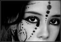
d o t s -&- l i n e sby annahComment: nice detail. editing your neat image copy on another layer in your photo editor and erasing around the eyebrows, tip of the nose, and some of the paint would really help remove the overly doll like appearance and improve your score...if you care about that. |
| Photographer found comment helpful. |
| 09/04/2005 09:42:08 PM |
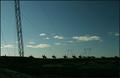
Dark & lightby StructorComment: your scene is very interesting, though probably more so without the foreground column. more of a zoom on what currently is the focus of the shot and a bit more saturation to accentuate the blue sky and green grass would have made for a very intriguing pic in my opinion |
| Photographer found comment helpful. |
| 09/04/2005 09:36:40 PM |
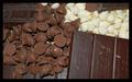
Dark and Light -- Chocolateby 4ROGGYCHEFComment: i think the kisses alone would have worked very well. perhaps upping the contrast would have strengthed the shot and the play between dark and light. right now there's this gray haze that kind of detracts from the pleasantness of the chocolate |
| 09/04/2005 09:32:42 PM |
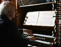
dolce e legatoby bicrayComment: the subject is interesting, but the lighting is a bit off. i think you needed to expose for the sheet music, and let everything else fall as it may. the keys and hands would have been well exposed. the shadow on the left looks very odd. i would have cropped out the levers on the right only because they are uncomfortalby soft compared to the rest of the composition. does he have the mirror to make sure the audience doesn't get too unruley? |
| 09/04/2005 09:18:44 PM |
Dumb & Lazyby LadeeMComment: i really like your choice of contrasting background...though i wish you used it more compellingly. I'm sure it was unintended but your shot needs a window because pc just got thrown out of it. |
| Photographer found comment helpful. |
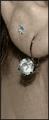
| 09/04/2005 09:11:08 PM |
Diamonds & Lobeby groggyfroggyComment: your choice for all that space below the ear is very intriguing. The fine hairs are a bit distracting |
| Photographer found comment helpful. |
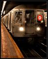
| 09/02/2005 10:20:48 PM |
The D Lineby pawdrixComment: fantastic capture. nice idea for the processing afterwards. i've looked at it too long and now i can't get off the fact that the headlights are very noticably different sizes and generally a distraction ;) still great idea and shot under tough conditions. |
| Photographer found comment helpful. |
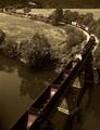
| 09/02/2005 10:13:57 PM |
Distance & Lengthby SJCarterComment: very crisp. though alot of brownish hues, would have liked to see it with only 2 or 3 colors. really like the engine smoke in the distance. wish you made that the center of focus by giving it more room from the top, rather than the foreground |
| Photographer found comment helpful. |
| 09/02/2005 10:09:48 PM |
Dark & Lightby thorgilsComment: i like this more when i turn it 90 degrees ccw. in that version my eyes scan from right to left but the branches sweep against them in the other direction making the view much more interesting to me. here my eyes seem to stay with the main 2 branchs. not sure what your intent was, but thanks for sharing it. |
Home -
Challenges -
Community -
League -
Photos -
Cameras -
Lenses -
Learn -
Help -
Terms of Use -
Privacy -
Top ^
DPChallenge, and website content and design, Copyright © 2001-2025 Challenging Technologies, LLC.
All digital photo copyrights belong to the photographers and may not be used without permission.
Current Server Time: 08/07/2025 09:11:44 AM EDT.