| Image |
Comment |
| 05/16/2010 05:58:00 PM |
A river of flowersby RUEDISCHMUTZComment: the destination of your leading line is very intriguing...i wish whatever it is, was a bit more prominent.-8 |
| 05/16/2010 05:48:48 PM |
The Eyes Have It...by youngnovaComment: i just saw the "blue eyes" photo before this one, and i think you should take a look for it. perhaps you could benefit with some more lighting from the right to lessen the strength of the shadow on her nose as i don't believe most would find it flattering for the type of portrait you appear to be shooting for -8 |
 Photographer found comment helpful. Photographer found comment helpful. |
| 05/16/2010 05:43:17 PM |
|
| Photographer found comment helpful. |
| 05/16/2010 05:40:20 PM |
Arabian Mareby karenkComment: this feels really well set up to me. The removal of the background and the look back of the horse and the excellent lighting. rule of thirds seems all good. something is missing for me though...I wish I got more personality of the horse from it.-8 |
| Photographer found comment helpful. |
| 05/16/2010 05:35:21 PM |
Mermaidby lapostoComment: nice portrait. i might have been inclined to crop it just below the bracelet.-8 |
| 05/16/2010 05:33:54 PM |
Fireball.by EgillPComment: nice image. i bet this looks better, the larger it gets. i'm a bit surprised you didn't go for the over used cinematic border...in your case, i think it might have provided a nice balance to the black of the foreground.-9 |
| Photographer found comment helpful. |
| 05/16/2010 05:31:04 PM |
2 Dollsby AmeedEl-GhoulComment: you've done such a good job of concealing the background, she looks cut out...perhaps that's the effect you were going for. -8 |
| Photographer found comment helpful. |
| 05/16/2010 05:27:36 PM |
Contrastby Prime_TimeComment: aptly titled. i like the negative space, but i also wish i could see more details in the building-8 |
| Photographer found comment helpful. |
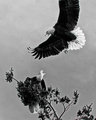
| 05/16/2010 05:24:53 PM |
Conflict 2by jbsmithanaComment: dramatic capture. at first i thought it was too bad you lost the wing, and that it hurt the overall composition. but perhaps it does well to mimic the continuation of the tree. a bit over-sharpened as the edges are haloing for me. and i've decided to go with too bad you lost the wing ;) -8 |
| Photographer found comment helpful. |
| 05/16/2010 05:19:01 PM |
|
| Photographer found comment helpful. |
Home -
Challenges -
Community -
League -
Photos -
Cameras -
Lenses -
Learn -
Help -
Terms of Use -
Privacy -
Top ^
DPChallenge, and website content and design, Copyright © 2001-2025 Challenging Technologies, LLC.
All digital photo copyrights belong to the photographers and may not be used without permission.
Current Server Time: 08/04/2025 07:27:21 PM EDT.