| Image |
Comment |
| 07/13/2005 08:37:52 PM |
Conjoinedby CorySmithComment: i like how you've overdone the flash...it's like they all have halos |
 Photographer found comment helpful. Photographer found comment helpful. |
| 07/03/2005 09:45:38 PM |
CabInteriorby dacrazyrnComment: interesting lighting. i find the floor and the chair legs particularly intriguing |
| Photographer found comment helpful. |
| 07/03/2005 09:43:29 PM |
"The Toolshed"by bryanbrazilComment: great leading line. i really like the red wagon wheel peeking out. perhaps a bit oversharpened |
| Photographer found comment helpful. |
| 07/03/2005 09:35:04 PM |
|
| Photographer found comment helpful. |
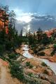
| 07/03/2005 09:30:35 PM |
High 'n' Wetby sidpixelComment: good leading line. your subject is a bit bland though. maybe it's just the weather. I really like the looks of that bridge down below. i wonder if looking up the river at that would have made a more enticing piece |
| Photographer found comment helpful. |
| 07/03/2005 09:26:58 PM |
Enlightenmentby nico_blueComment: great mood. great exposure. great title. the wavy reflection really adds that extra interest to grab the eye first and then directs it into the pic |
| Photographer found comment helpful. |
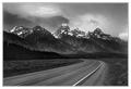
| 07/03/2005 09:23:07 PM |
Bryce Canyonby jrtoddComment: nice pic. wish i had more water in the foreground to start my eye better from the bottom right...maybe it wasn't possible to move any further to the right. tough to expose shooting into the sun. i wish i could see more detail in the trees and canyon walls |
| Photographer found comment helpful. |
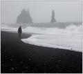
| 07/03/2005 09:14:02 PM |
The Wild Seaby babylonComment: the beautiful black sand of iceland. nice shot. i think that beach and the sealine would have also made a wonderful abstract. i received alot of similiar comments, which slightly annoyed me, but i just have to say I wish the person wasn't there and i just had nature |
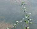
| 07/03/2005 09:08:18 PM |
Intersectionby TitiaComment: i think you had a good idea. i wish you had that ripple at the intersection of the branches rather than way at the top. pic could use more contrast or saturation. i think the fish is an interesting addition...unfortunately you can barely make it out |
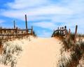
| 07/03/2005 09:00:29 PM |
To The Beachby edisComment: interesting technique. really like your colorization. the big pole on the left is a bit distracting |
| Photographer found comment helpful. |
Home -
Challenges -
Community -
League -
Photos -
Cameras -
Lenses -
Learn -
Help -
Terms of Use -
Privacy -
Top ^
DPChallenge, and website content and design, Copyright © 2001-2025 Challenging Technologies, LLC.
All digital photo copyrights belong to the photographers and may not be used without permission.
Current Server Time: 08/05/2025 04:15:20 AM EDT.