|
|
| Image |
Comment |
| 03/16/2004 09:42:06 PM | |
| 03/16/2004 03:48:15 PM | Taschaby johnmComment: personally I feel the orange is a bit strong, however the rear lighting should be a highlight and is blown way over the top by about three stops perhaps. Hair lights in portraits is a very nice addition accenting detail or snap in a shot, but taken to an extreme it can ruin a shot too. Ironically, the exposure on the face is good in fact, but it is just overtaken by the rear lighting. It is also nice when using hair-lights, to get a catch light on the shoulder line as well if you can.
|  Photographer found comment helpful. Photographer found comment helpful. |
| 03/16/2004 03:41:26 PM | HOW YOU DOINGby TLL061Comment: I just feel this is not worthy of a portrait entry in all aspects. its not a pose, expression, lighting and exposure are poor. |
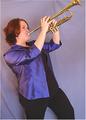
| 03/16/2004 03:35:21 PM | All That Jazzby jpochardComment: in reality your exposure of the suject ispretty nice though a catch-light on the hair would be a good addition. However, in 99% of all portrait work, the background should just about always (if not always) be at least blurred out in the DOF at a minimum. The wrinkles and the pin-up point just above the finger area is a strong detraction as well. Now to the subject, its a general bad feeling to cut off any part of the subject that is a strong focus point, and in this situation the flare of the horn should be in frame. However, a great portrait is either a FACE, a PERSONALITY or both, but most importantly it should generate a feeling for the person, not the photo. | | Photographer found comment helpful. |
| 03/15/2004 04:02:27 PM | So Aloneby sjonniComment: very good job here, just a tad bit cool in color, and just a tad too harsh. A warm/gold reflector on the right would have seemed to have caught a nice 3-stop fall off but get just a bit of detail in the dark side. But on the right track for sure... |
| 03/15/2004 03:59:05 PM | Veronique by sahkoComment: This is good to me, good background fusion, fall off is very good, and managed a good expression. I only wish she wasn't quite so centered. Good Job | | Photographer found comment helpful. |
| 03/15/2004 03:56:30 PM | Josh and Melissaby boyte1Comment: good background work, but the warm cast is way over the top too much in my taste, face lighting is too harsh for "couples portraits", and a hair light would have helpped a great deal I feel. | | Photographer found comment helpful. |
| 03/15/2004 01:17:58 PM | A Manby ellamayComment: now this subject has so much more potential, too me it just lacks the pop and depth. I hope you don't take this wrong, but you really had a winner here if it weren't quite so flat an with perhaps a bit of different composure. | | Photographer found comment helpful. |
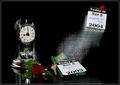
| 11/19/2003 12:24:22 AM | "Same Time, Next Year" - a romantic comedyby jefalkComment: I had tossed it back and forth on what exactly to put or keep in the photo trying to hold the intended attention/focus intact, but with the shot already taking just over 7/hrs, this was the result and I had too stop trying. However, in the books' story (or the movie with Alan Alda), the anniversary clock along with the rose in my opinion strengthened the symbolic romance through their annual 25 year affair. I did like the fact that the clocks pendulum also showed a nice motion effect in the shot as well. Of course this is always so subjective.
Photographically, the shot was f25-5/sec as a summation of 45/flashes; a main burst of (4) studio heads totaling 1200ws with some softboxes and reflectors, and then 40 hits of my Canon 550EX at 1/128 and 8hz creating the motion effect. The date/year changing mid-flight was because I printed a second set of date slips and glued them back to back and opposite top to bottom on a coat hanger painted flat-black. The initial position of the coat-hangered slips was just behind and below the upper 2004, and right after the main burst which started the strobes, I swooped it down and flipped it front to back mid-flight changing the face to 2003 as it settled at the bottom of the shot.
I was determined to tell the story of the title with a hint of the plot as well in a single exposure; and try and pull off a very technically challenging shot (for me anyway)... I was pleased with the fact that I had sketched a story-board for this shot with detail, and it turned out just about exactly as I had planned right down to the subtle details in the rose. A bunch of work, but tons of fun too!
Thank you all again for all the nice comments,
John
|
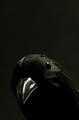
| 11/17/2003 01:58:52 PM | Akula the Black Birdby jab119Comment: Love the fact that the BG is not perfect black, it add a mysterious depth to the shot in my view. The subtle exposure on the head vs the harsh highlights on the eyes and the beak are very nice. Great shot. | | Photographer found comment helpful. |
Home -
Challenges -
Community -
League -
Photos -
Cameras -
Lenses -
Learn -
Help -
Terms of Use -
Privacy -
Top ^
DPChallenge, and website content and design, Copyright © 2001-2025 Challenging Technologies, LLC.
All digital photo copyrights belong to the photographers and may not be used without permission.
Current Server Time: 08/03/2025 10:11:49 PM EDT.
|