| Image |
Comment |
| 06/30/2004 11:48:58 AM |
Canna at Duskby pjterrellComment: Not much to interest me in this shot. The object in the foreground is not specific enough and should not have had it's edge cropped out. The object on bottom right is distracting. I like the blur on the tree in the background. |
| 06/30/2004 11:46:32 AM |
That's Extraordinary!!!!by LENWOODBLUZComment: Good idea and well executed.Might help to have a little more negative space in front, but I don't know if that was possible. Also, would have preferred a real woman instead of a poster. |
| 06/30/2004 11:44:18 AM |
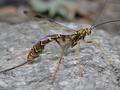
The Waspby canyoncatComment: Good shot. The only improvement I can think of is the one that scares them away, Take the shot from the front. Nice capture. |
| 06/30/2004 11:38:38 AM |
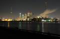
Extraordinary City of Torontoby notonlineComment: I like the effect on the smoke rising from the chimneys. I think you could have cropped a little more of the bottom off. A panoramic shape would work better. |
 Photographer found comment helpful. Photographer found comment helpful. |
| 06/30/2004 11:36:08 AM |
Extraordinary Colorby DigichromeComment: The color and lighting are good. The background color works well. I'm not a big fan of closing the DOF so much that only a very small portion of the subject is in focus, but that's me. |
| Photographer found comment helpful. |
| 06/30/2004 11:34:53 AM |
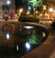
Extraordinary Rendez-vous Spotby traserComment: I like that you caught motion in what you would think was still water. Maybe just a bit overexposed, the banding on the stars from the lights looks a little odd. |
| 06/30/2004 11:33:30 AM |
Saturday Nightby ayaleComment: The action shows the guitarist really getting into his work. I think the negative space behind him should be in front of him. |
| 06/30/2004 11:30:38 AM |
Balanceby KolyaComment: I think this shot could use a little more negative space, maybe on the right. Good color, lighting and focus. |
| Photographer found comment helpful. |
| 06/26/2004 02:21:02 PM |
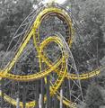
Twistedby jimmyn4Comment: Good composition and choice, but the picture looks a bit washed out. |
| Photographer found comment helpful. |
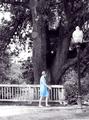
| 06/26/2004 02:20:18 PM |
Blue Dressby dsrayComment: The composition is good, but the bottom of the shot is too washed out with the light. |
Home -
Challenges -
Community -
League -
Photos -
Cameras -
Lenses -
Learn -
Help -
Terms of Use -
Privacy -
Top ^
DPChallenge, and website content and design, Copyright © 2001-2025 Challenging Technologies, LLC.
All digital photo copyrights belong to the photographers and may not be used without permission.
Current Server Time: 08/18/2025 04:17:02 AM EDT.