| Image |
Comment |
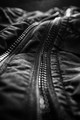
| 09/08/2014 01:57:59 PM |
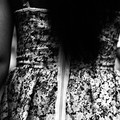
over hill, over daleby tvsometimeComment: Interesting. It does have a landscape feel with the patterns of the clothing. Good choice to use B&W, and good focus and tones. |
 Photographer found comment helpful. Photographer found comment helpful. |
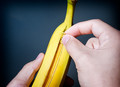
| 09/08/2014 01:57:00 PM |
Re-Engineered for Perfectionby DamonComment: Good concept and mostly well executed. I see a blob in the backdrop on the top left, and leaving off the top of the banana may or may not have been a good choice, if it was misshapen or ugly I probably would have recommended shearing it off and at least composing to include what's left. |
| Photographer found comment helpful. |
| 09/08/2014 01:54:46 PM |
Shhhby giantmikeComment: Very nice concept and well executed. Simple, and the in-focus areas are well placed. Tilt-shift lens? |
| Photographer found comment helpful. |
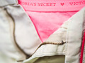
| 09/08/2014 01:53:40 PM |
Mums The Wordby HornOUBetComment: Nice simple concept, could have been improved by some technical improvements though. There is some ghosting on the fingers, usually caused by using the flash combined with a slow enough shutter speed to take in ambient light while the subject moves.
It would look better if you used off-camera lighting - doesn't have to be a flash, just get close to whatever light source it is. That would allow you to use a smaller aperture for more DOF - there's no reason not to have the entire face in focus for a close-up concept shot like this.
I would also recommend touching up the zipper pull's chipped paint - easy enough with either a paint brush tool, a mask or selection to do localized brightness/contrast, or even clone stamp. |
| Photographer found comment helpful. |
| 09/08/2014 01:48:02 PM |
... hmmby TiberiusComment: Visually this is very good, and I think it would make a good print in a sort of abstract way as a study of shapes and textures and colors. I don't get the concept if there was meant to be one, though. |
| Photographer found comment helpful. |
| 09/08/2014 01:46:53 PM |
|
| Photographer found comment helpful. |
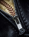
| 09/08/2014 01:46:11 PM |
Parting Waysby dtremainComment: Good composition, but it could benefit from more sharpness and depth of field to include the YKK letters, and also more contrast. |
| Photographer found comment helpful. |
| 09/08/2014 01:45:11 PM |
oh sew trendyby PennyStreetComment: This has the makings of a good photo, but it's lacking in sharpness and the black hair would stand out better with a lot more light. |
| Photographer found comment helpful. |
| 09/08/2014 01:37:52 PM |
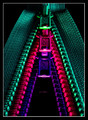
Z is for ....by adriano74Comment: This is very cool. I like the neon colors and the striking contrast, and the composition is great. Maybe it's a calibration issue but all I see of the fourth row is the bright part of the zipper pull. If it was meant to be that dark, I would have left that out to keep it simple. |
| Photographer found comment helpful. |
| 09/08/2014 01:35:57 PM |
Helping handby lei_73Comment: Nice composition, lighting and tones and you've done a pretty good job making the black dress stand out from a black background, but I think another color dress would have worked better. |
| Photographer found comment helpful. |
Home -
Challenges -
Community -
League -
Photos -
Cameras -
Lenses -
Learn -
Help -
Terms of Use -
Privacy -
Top ^
DPChallenge, and website content and design, Copyright © 2001-2025 Challenging Technologies, LLC.
All digital photo copyrights belong to the photographers and may not be used without permission.
Current Server Time: 06/21/2025 11:31:54 PM EDT.