| Image |
Comment |
| 05/05/2011 11:29:03 PM |
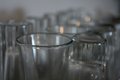
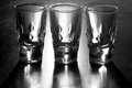
All in a Rowby lindsaynortonComment: this feels a bit flat in the contrast. the depth of field works well, and I like the way the frame is filled, but I wish there was something .. more. |
| 05/05/2011 11:28:01 PM |
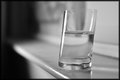
Shotglass on it's sideby NathanRantaComment: for a shot like this, it'd be nice if there was more in the image- that is, a story about why there's a shotglass outside on the concrete. maybe showing more of the surroundings, or someone passed out drunk, or.... something.
as it stands, it's sorta bland, the lighting isn't terrible, but it's not great either. there's a very strong/warm color cast, which would be nice -- if there was more clue to the environment. |
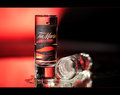
| 05/05/2011 05:21:29 PM |
Tia Maria - Liqueur Spiritby AllenPComment: nice lighting, smooth colors. the bokeh is a little uncommon for 'product' shots. The only critique I really have is nit-picky, I don't care much for the little white reflections on the top of the vertical shot glass. |
 Photographer found comment helpful. Photographer found comment helpful. |
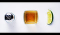
| 05/05/2011 05:18:13 PM |
Tequilaby stantheman1313Comment: nice emphasis on shape, I appreciate that.
with the perspective flattening everything out, I almost wish it was cross lit a bit to even-further get rid of the shadows.
only other suggestion is that your lime looks awfully dated, either old or dry, and a bit of freshness would really make it look better. |
| Photographer found comment helpful. |
| 05/05/2011 05:13:36 PM |
"Shot Glasses!"by supanovaComment: the 'blood' on those glasses looks entirely too real. I can't say I'm a terrible fan of the pun, or the pink glasses. the 'blood' dripping is interesting, especially at the base of the glasses, and I'm not sure the big splotchy puddle is even necessary, and feels like it takes away from the authenticity of the scene. |
| Photographer found comment helpful. |
| 05/05/2011 05:10:29 PM |
Low Key by CrazyDiamondComment: there's a lot of weird materiality in this. I don't mind the dirty/dusty/grungy look, but I do wish it was a little more consistent, for example, the material that the glasses are sitting on vs the more scratched/less reflective metallic background. I like the back-lighting, but it seems like the light source is really smally (can see hairlights on the right glass and middle glass, but not the left-most glass. |
| Photographer found comment helpful. |
| 05/05/2011 02:40:29 PM |
On Tiltby esasafeComment: nice formal shot.
borderline feels like it's placed on a step (as opposed to a counter/shelf)
the shadow in the background, as well as the highlights add just enough character to this. I also get the feeling this was done in natural light, am I correct? |
| Photographer found comment helpful. |
| 05/05/2011 02:38:23 PM |
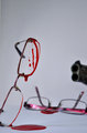
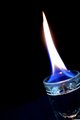
Devil's Drinkby dali_lama_2kComment: With this title, it would have been neat had you been able to convince the flame to split into two.
on a formal side, the edges of the glass feel a bit soft focused, and i'm not terribly fond of the crop |
| Photographer found comment helpful. |
| 05/05/2011 02:36:53 PM |
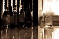
Dont look at me like that!!by BigmeLIEComment: I can read bacardi, but I'd really like to be able to see the labels a bit more clearly of the other liquor. I like the sepia, and the dirty glass. the reflection feels natural in this one as well. The odd shaped wooden things are trying to steal the show from the bottles on the left side as well. |
| Photographer found comment helpful. |
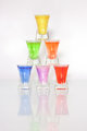
| 05/05/2011 02:34:50 PM |
Color Pyramidby kannewurfComment: This feels a bit strange on a few levels. It seems to lean just a bit to the left, but that just might be my eyes. I also think the reflection is given a bit too much real-estate on the page. It's not bright enough or sharp enough to be interesting, maybe if this was shot on a mirror, that'd be different.
the main thing that I noticed, and is probably what's going to hurt your score a bit from the other voters is that the lighting is causing some really strange highlights on the glasses, while simultaneously making the scene feel very flat/low contrast. If these glasses were lit from one side (and have a black card as your bounce on the other side) you get really strong contrast, and a nice looking vertical stripe on the side of the glasses. |
Home -
Challenges -
Community -
League -
Photos -
Cameras -
Lenses -
Learn -
Help -
Terms of Use -
Privacy -
Top ^
DPChallenge, and website content and design, Copyright © 2001-2025 Challenging Technologies, LLC.
All digital photo copyrights belong to the photographers and may not be used without permission.
Current Server Time: 08/04/2025 02:49:31 PM EDT.