| Image |
Comment |
| 12/18/2002 08:43:53 PM |
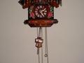
Time In Motionby kposeyComment: Greetings from the critique club!
Because the pendulem is not straight down, this shows motion, and so it definetly meets the challenge. The subject is a nice object too, and it would have been fine to show more of it.
The lighting is bright enough, and the focus is clear. As you have already heard by now, it would have been much better to show the whole clock.
Grayce aka Gracious |
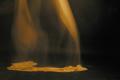
| 12/18/2002 07:55:43 PM |
Fallen angelby GoatfatherComment: This is an impressive image, and the concept is unique. The motion is nice and fluid and the dreamy quality comes through. I love the way the fabric lays on the ground.
The coloring is nice, but needs to be a little brighter. Perhaps experimenting with different lighting and moving it around...maybe just brighter light shining on the cloth on the floor.
I like the simple composition very much. OVerall you did a nice job. |
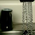
| 12/18/2002 07:41:44 PM |
Down the Drainby crabappl3Comment: Your focus on the water is excellent! Each droplet is so wonderfully clear. I especially like the ones that are shooting out on their own to the left, captured in mid-air.
Your lighting is quite good, highlighting the water.
Composition has room for improvement. The knob in the back is distracting. It takes up a lot of the image, but isn't clear enough to really add anything to the composition. A possible solution might be to put something in front of it...fabric, paper, I don't know what for sure. Maybe just cropped out. I'd like to see the glare on the sink ledge toned down, or just covered along with the knob in the back.
Overall you did a good job of freezing the motion, and met the challenge well.
|
 Photographer found comment helpful. Photographer found comment helpful. |
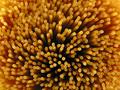
| 12/17/2002 10:42:49 PM |
Spaghettiby JackoComment: Jacko, I like this very much, as I've already stated during voting. The composition is a good and works well as an abstract. The way the spaghetti separates near the center, leaving some dark space adds depth to the image. As you look down you see the gradations of color fading into darkness, giving it dimension. I've worked a lot with pasta, both as a chef and photographer and can really appreciate it.
Filling the entire frame with the pasta was a good idea. It has much more impact than if you'd included some background. The pattern is sufficient and needs no bg info. Any bg would have been a distraction.
Lighting, focus, exposure, perspective, all work well. DOF is right on. Coloring seems to be good.
There is noting I'd change here. I think it's a terrific image. It would be nice hanging in a kitchen. Good job!
|
| Photographer found comment helpful. |
| 12/17/2002 12:00:13 AM |
|
| 12/16/2002 11:55:43 PM |
eBay Entrepreneurby DougPazComment: Been there, done that! Sold lots of stuff for a couple of years. Good picture! Unusual, and I'm sure no one else has entered the same...lol Lighting, composition, exposure, are all good. |
| Photographer found comment helpful. |
| 12/16/2002 11:49:01 PM |
|
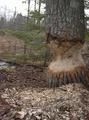
| 12/16/2002 11:38:47 PM |
Beavers Woodworkingby HBunchComment: Ahhhhh a very familiar scene to me. The picture tells a story and that is good, but the composition doesn't have any real punch. Perhaps a different angle.
DOF is very good. |
| Photographer found comment helpful. |
| 12/16/2002 11:35:52 PM |
frost flowersby kenboComment: Nice, dreamy quality. The blue looks a little unreal, like it was manipulated by the hand of man, but the subject compensates. I like it. |
| Photographer found comment helpful. |
| 12/16/2002 11:22:31 PM |
|
| Photographer found comment helpful. |
Home -
Challenges -
Community -
League -
Photos -
Cameras -
Lenses -
Learn -
Help -
Terms of Use -
Privacy -
Top ^
DPChallenge, and website content and design, Copyright © 2001-2025 Challenging Technologies, LLC.
All digital photo copyrights belong to the photographers and may not be used without permission.
Current Server Time: 08/24/2025 04:17:44 AM EDT.