|
|
|
Showing 1551 - 1560 of ~3606 |
| Image |
Comment |
| 04/08/2003 04:34:29 PM | |  Photographer found comment helpful. Photographer found comment helpful. |
| 04/08/2003 09:54:15 AM | A perfect match.by SharQComment: Critique CLub Comments by Grayce
Wonderful composition with very appropriate framing. It's a simple composition, which I admire. No clutter here! Straightforward, uncluttered.
The exposure is very good and could almost fit in the symmetry challenge as well. The hot spots are acceptable, and lend credence to this flame picture. One of the few subjects that can use hot spots to advantage!
There is no digital noise here, nor artifacts.
Focus is excellent.
Overall excellent image and deserving of high scores.
Regards,
Grayce |
| 04/08/2003 09:47:05 AM | Decophoneby mbardeenComment: Critique Club Comments by Grayce
Greetings!
This will be difficult because I don't have much to say about this. I like it very much.
The double curves are very appealing, and the texture adds quite a bit of interest. On top of that the coloring is wonderful and the lighting is perfect.
An extremely nit-picky thing is a speck of dust near the bottom. Or is it a nick in the metal? It is very, very minor but my eye keeps going to it, and makes it a hair less than perfect.
The composition is excellent, and is graphically very strong. I love the abstractness of it.
OVerall a very excellent job!!
Regards,
Grayce | | Photographer found comment helpful. |
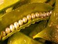
| 04/07/2003 12:13:06 PM | Fresh Sugar Snap Pearlsby GraciousComment: These are real sugar snap pea pods. I carefully opened this and placed pearls in it.
I tried photographing this under a light tent to soften the glare, but the pearls still took on the reflection of light. They also took on the green tone of the pods. So I desaturated a the whole image a little to eliminate the green on the pearls. Unfortunately it also washed out the green of the pods.
Thanks to all of you who commented.
|
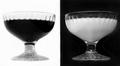
| 04/07/2003 12:08:15 PM | Black & Whiteby WILDBLUEComment: Critique Club Comments by Grayce
Nice concept here! The contrasts provide a lot of interest.
I think that a sharper focus would serve this well, mainly because of the extreme opposite of the black and white. In other words, the contrast would be stronger if sharper. Softer focus doesn't enhance contrast too well.
Anyway, I do like this image. It seems to fit the challenge well.
The lighting was well handled with no harsh reflections. The composition is very good.
There is no noise or digital artifacts, congrats! With black that isn't easy.
Nice work!
Regards,
Grayce | | Photographer found comment helpful. |
| 04/06/2003 08:37:02 PM | From Another Time...by mliborioComment: Critique Club Comments by Grayce
You captured this old building beautifully. The architecture is wonderful and this building makes a great subject.
The composition is good. In many cases having the subject centered looks too static, but I think it works for this one.
Including people in this image gives life to it.
The exposure is good, with no over or under-exposed spots, and shows clearly visible details.
Your focus is fine, not any blurry spots.
This doesn't jump out as a "Time" picture, but I can see how you fit it in. Especially with the satellite dishes, it shows an old building with modern technology, which indicates time past and present.
Overall this is a nice image, not particularly exciting.
It seems to me that you can handle your camera quite well, but more consideration for the challenge subject would help you score better.
I look forward to seeing more of your work.
Regards,
Grayce |
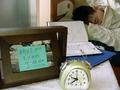
| 04/04/2003 10:09:50 PM | Late!by starblazerComment: Critique Club Comments by Grayce
Nicely interpreted of the challenge. It meets the challenge very well.
Depth of field is good, with everything being in good sharp focus.
Your exposure is also quite good, with no burned out spots nor lack of detail.
It looks as if this was thought out and carefully executed. I notice that some object to set up pictures. I think it just adds to your credit to not leave things to chance. Even though you planned this out I think it actually looks quite natural. It would probably make a good stock shot too.
Good work!
Regards,
Grayce | | Photographer found comment helpful. |
| 04/04/2003 09:50:32 PM | Cellar, Penfolds Wineryby GordonComment: Hi Gordon!
On behalf of the CC here I am. I like, no, LOVE the coloring here. The wood is so warm and aged looking. The subject matter is just so photogenic and the contrast with the metal is wonderful.
In a rather abstract sense it meets the challenge, since it takes time to age wine usually, but it is sort of implied rather than clearly evident.
The perspective is ok but leaves room for improvement imho. Seeing more of one or two of the barrels with their rich character would make this image even better.
Having shallow depth of field is ok, but it would be nice to see the front barrell in focus better. There is only one barrel in relatively sharp focus, and I don't think it's sufficient. I'd like to be able to see some of the texture. Of course I realize that this is entirely up to the artist.
The lighting is very nice, and is the strength of this image.
Regards,
Grayce
|
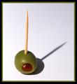
| 04/04/2003 09:42:44 AM | Oliveby JackoComment: Very nice, simple, effective. | | Photographer found comment helpful. |
| 04/03/2003 12:44:01 AM | Zenby CoreyComment: Great job!! The color is great and the simplicity of this is wonderful. | | Photographer found comment helpful. |
|
Showing 1551 - 1560 of ~3606 |
Home -
Challenges -
Community -
League -
Photos -
Cameras -
Lenses -
Learn -
Help -
Terms of Use -
Privacy -
Top ^
DPChallenge, and website content and design, Copyright © 2001-2025 Challenging Technologies, LLC.
All digital photo copyrights belong to the photographers and may not be used without permission.
Current Server Time: 08/25/2025 02:03:19 AM EDT.
|