| Image |
Comment |
| 03/20/2005 06:19:00 PM |
|
| 03/20/2005 06:16:43 PM |
Best friends mix wellby shiva5381Comment: As I am expecting a Coke botle to be blood red I am unsure if this shot is just over exposed or whether the colour has been adapted, I feel the shot is not quite one colour nor the other tho. |
| 03/20/2005 06:11:50 PM |
Coexistenceby caustinComment: I think I would have to put this one down to unfortunate lighting as the duck at the rear is over exposed and the one at the front is suffering a little under exposure as he has a dark head unable to see the strong greens he has. still the composition is great. |
| 03/20/2005 05:59:49 PM |
|
 Photographer found comment helpful. Photographer found comment helpful. |
| 03/20/2005 05:56:01 PM |
|
| Photographer found comment helpful. |
| 03/20/2005 05:47:54 PM |
The Starting Lineby eaglebeckComment: lacking in an overall focus as the focal point of all the helmets don't quite seem in focus to me. I would love to see this slightly shaper and the background desaturated to make it a selective colour shot. Still a great shot none the less 8 |
| 03/20/2005 05:45:00 PM |
At the end of the day...........by tolovemoonComment: this dosn't quite work as a silhouette due to the light on the swings if it is meant to be, if not then I would have brought up the levels to see the lines in the fence a little better and perhaps a polarisor to bring out the blue in the sky more too. |
| Photographer found comment helpful. |
| 03/20/2005 05:40:38 PM |
how manyby nialljallenComment: This would have looked better without being able to see the land, I would have cropped this 3/4 of the way down from the top as the greenery draws me down instead of looking at the intricacy of the overhead power cables. |
| Photographer found comment helpful. |
| 03/20/2005 05:36:12 PM |
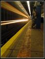
It's About Timeby trnqltyComment: I like the overall shot and feel but the pillar on the right not beeing level throws me slightly and I would have prefered a little more of the pillar above the '86 street' writing as it draws me to the white text somewhat as well as the train lights going past, can't decide on a focal point. 9 |
| Photographer found comment helpful. |
| 03/20/2005 05:32:10 PM |
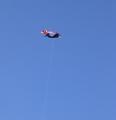
One Thin Lineby scottwilsonComment: Nice use of negative space and I especially like the fact that the line is the focus and not the actual kite ( I first thought shame that its the kite that is not quite in focus yet the focal point then I realised what the challenge was ! ) wheter intentional or not it works for me. 8 |
| Photographer found comment helpful. |
Home -
Challenges -
Community -
League -
Photos -
Cameras -
Lenses -
Learn -
Help -
Terms of Use -
Privacy -
Top ^
DPChallenge, and website content and design, Copyright © 2001-2025 Challenging Technologies, LLC.
All digital photo copyrights belong to the photographers and may not be used without permission.
Current Server Time: 09/04/2025 07:18:14 PM EDT.