| Image |
Comment |
| 11/17/2003 02:32:08 PM |
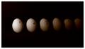
Don't Count Your Chickens Before They Hatchby Spanish_GreaseComment: Good literalism. I like the tonal progression idea here, though it may be too dark too quickly. One other just purely aesthetic comment is that the picture might have been more interesting a shot photographically/artistically if 1) taken with a bigger perspective emphasis, and with another means to indicate counting besides the handwritten numbers (maybe a tape based caldulator) |
 Photographer found comment helpful. Photographer found comment helpful. |
| 11/17/2003 02:29:19 PM |
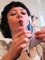
Girls Are Weird!by darcyComment: Interesting shot, though I don't believe this is a llteralism. It's just a fact ;-)
Might have been good to run this through neat image to reduce the noise; though it's also possible you just have too high a JPEG compression ratio. |
| Photographer found comment helpful. |
| 11/17/2003 12:25:58 AM |
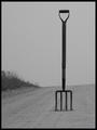
Look for the fork in the road!by ColeyComment: Excellent idea. Good scene and composition. A little more contrast might improve this, and a bit of NeatImage for noise reduction. |
| Photographer found comment helpful. |
| 11/17/2003 12:23:58 AM |
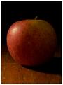
The Big Appleby tomlewis1980Comment: Good shot; perhaps it would have been good to include something else to give us a perspective that this was really "big". Something that's smaller than usual. Or use distance perspective to make it look bigger than it is. |
| Photographer found comment helpful. |
| 11/16/2003 10:35:00 PM |
|
| Photographer found comment helpful. |
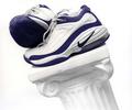
| 11/16/2003 10:23:21 PM |
Nikeby ArnayComment: Critique Club:
This is a good, sharp, generally well exposed image. It's well composed, offering the focal point (shoes) close enough to the upper left intersecting thirds gridlines. It offers a nice duotone-like image with the predominately blue and white theme.
I think the choice to slant the pillar is key here, and a good design. I think even a little more pitch on the slant might have been a little more interesting, giving you a bisecting diagonal composition.
Small relatively non-significant issues here: the center bottom of the column is slightly hot; the bottom of the right shoe could have more shadow detail.
I am not sure what the real message is here; if a product shot, I am not sure the placement of the shoes would sell; if an artsy shot, I am not totally convinced it would "sell"; if it's a shot for running or sports enthusiasts, I think it would work very well for those who like nikes.
Overall, I think its done very well. |
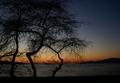
| 11/16/2003 09:53:42 PM |
Communionby ellamayComment: Nice shot; it would have been cool if you could have taken it with the water "aglow" as it sometimes is just around that time (maybe earlier.) |
| Photographer found comment helpful. |
| 11/16/2003 09:52:47 PM |
|
| Photographer found comment helpful. |
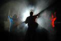
| 11/16/2003 09:52:14 PM |
Sacred Worshipby jmark53Comment: An interesting shot, What is it? My guess would have been an ordinary stage performance to me with the guitar and the red led showing in the background. (Actually, the first time I saw it I did think that it was a staged "worship". but when I saw the guitar, I was confused.) |
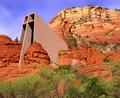
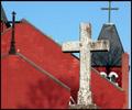
| 11/16/2003 09:48:18 PM |
Red and Crossesby ColeyComment: Good composition and use of DOF. The grain or noise complements this shot; to me that's unusual. One technical issue: the right most cross should not have been cut off in this composition. |
| Photographer found comment helpful. |
Home -
Challenges -
Community -
League -
Photos -
Cameras -
Lenses -
Learn -
Help -
Terms of Use -
Privacy -
Top ^
DPChallenge, and website content and design, Copyright © 2001-2025 Challenging Technologies, LLC.
All digital photo copyrights belong to the photographers and may not be used without permission.
Current Server Time: 08/28/2025 04:20:01 PM EDT.