DPChallenge: A Digital Photography Contest You are not logged in. (log in or register
 
Browse Settings
Currently viewing:
MemberNeil

Show comments:

Per page:

Order:

Comments:


Comments Made by Neil
Pages:   ... [360] [361] [362] [363] [364] [365] [366] ... [385]
Showing 3621 - 3630 of ~3843
Image Comment
The Cuban aroma
11/28/2003 06:10:11 PM
The Cuban aroma
by Jason

Comment:
A novel shot. I think it would have been improved by placing the cigar on a mirror and shooting from somewhat above. I don't think having the cigar on the edge, and a slice of it possibly even cropped, is the best composition.
Photographer found comment helpful.
Scent of a Quail
11/28/2003 06:07:27 PM
Scent of a Quail
by chimera

Comment:
I like the shot here a lot, but the excessive noise (from using too much JPEG compression) spoils it's beauty somewhat. It's especially distorted on his face.
Photographer found comment helpful.
by a creek in the Australian bush
11/28/2003 06:06:24 PM
by a creek in the Australian bush
by amwab

Comment:
Looks like a good picture, but it's so small, it's hard to judge. Next time I suggest trying to make it so the larger dimension is closer to 640 (the size limit).
Movie Time
11/28/2003 06:05:33 PM
Movie Time
by Pooba

Comment:
Good mix of the theme with the popcorn! I did have trouble recognizing that as a movie reel until I read your title, so my advice for next time would be to include more contextual cues, or more of the reels shape.
Photographer found comment helpful.
Pinky Rose
11/28/2003 06:04:39 PM
Pinky Rose
by HariCoelho

Comment:
Nice rose and effort. This has too much noise for some reason (perhaps too high a jpeg ratio?) and is a bit overexposed at the bottom of the rose.
Scented sentiments
11/28/2003 06:03:29 PM
Scented sentiments
by drydoc

Comment:
Very nice still life. I am mixed about the inclusion of the lamp at the upper left though.
Some bases of Curry
11/28/2003 06:02:18 PM
Some bases of Curry
by fanfuine

Comment:
Very good lighting and shot. I like this in general, butit seems like it still needs something else for more pop. I am not sure, maybe another contrasting color in there?
Photographer found comment helpful.
Morning Coffee
11/28/2003 06:00:30 PM
Morning Coffee3rd Place
by Artifacts

Comment:
Good job capturing my favorite beverage. Having all the steam makes it that much better a photo (aesthetically) too. I think it might have been good to have a bit more of the pot there, and maybe a cleaner background than this (I am not sure what the dark blue is here).
Photographer found comment helpful.
POOOOOOOT!
11/28/2003 05:54:42 PM
POOOOOOOT!
by dadas115

Comment:
It's eye catching, but I am not sure what the title means, nor the relationship to scents and aromas. Thre seems to be a fair amount of noise, and the hi-key approach is a bit disorienting here. I can't tell if the frog is standing or jumping or what!
Road Signs Never Lie
11/28/2003 03:37:22 PM
Road Signs Never Lie
by wwjdwithca

Comment:
I saw your comment about this and I thought I would offer my 2 cents worth of feedback.

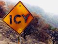
Artistically, the photo is good. This is despite at least one significant technical flaw, the bright overexposed sky (which may be totally fog, one can't easily tell here, as the bleeding of the overexposure into the trees could also just be the spread of the fog.) I really like the way you've composed it, just in terms of aesthetics.

However, the message doesn't really come through here. I see a sign, which says icy. I presume you are near a bridge (issue: there's no context for us here), but at the very least, I don't see desert (which would be funny). I really couldn't tell where it was, nor can I tell what the white marks are on the sign (either ice or pock marks). I looked at this a while when I voted, not sure if that was ice. Given the white tops of the branches of the tree just below right of the main part of the sign, and the white-ish color of the grass, I actually presumed this was ice/frost. And living in the northeast I am no stranger to frost.

Whereas I think you particularly liked this because you saw a contradiction, at least I don't see it, which lessens it's appeal somewhat. I felt it was fair to consider it a valid entry, as I could see a government program to convince us of the importance of believing road signs. But I don't think this image supports such a propaganda effort (nor one to the contrary even, again because of it's ambiguity).

Hope this helps you understand a different perspective on an image--something important here. I haven't been here long either, but I believe understanding how your photos are interpreted by other people is one of the values here. And by the way, I gave you an average score on this.

Pages:   ... [360] [361] [362] [363] [364] [365] [366] ... [385]
Showing 3621 - 3630 of ~3843


Home - Challenges - Community - League - Photos - Cameras - Lenses - Learn - Help - Terms of Use - Privacy - Top ^
DPChallenge, and website content and design, Copyright © 2001-2025 Challenging Technologies, LLC.
All digital photo copyrights belong to the photographers and may not be used without permission.
Current Server Time: 09/01/2025 02:35:04 PM EDT.