| Image |
Comment |
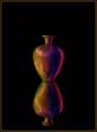
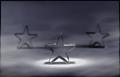
| 12/16/2003 08:19:46 PM |
Simply a Vaseby ShelleyComment: Excellent shot and use of symmetry. I like the dark tones and richness it gives the colors. The centered composition seems ok here, but as long as you have that, you might have just gone for broke and make the vases fill the frame vertically as well, giving complete symmetry of the composition as well. |
 Photographer found comment helpful. Photographer found comment helpful. |
| 12/16/2003 08:16:46 PM |
The Simple Lifeby mirdonamyComment: I like the colors and composition. It might have been a good one to run through neat image on low settings to remove what looks like chroma noise in the light fur. |
| Photographer found comment helpful. |
| 12/16/2003 08:13:50 PM |
|
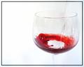
| 12/15/2003 12:34:13 AM |
Water into Wineby jaimeegrlComment: Funny--I had the same idea but never shot it, hated to waste good wine. I think having the glass more full would have been better, and of course watching for the water splashes (see the front right). Might have also been good to include the full glass, just for that class of elegance. But still a good and fun entry. |
| Photographer found comment helpful. |
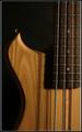
| 12/14/2003 08:46:42 PM |
The Shape of Bassby NazgulComment: Good compositiont. I am not sure why this shot doesn't have a good feel for me; I think it's partly the light and the sharpness. I compare it to the other guitar shot, where the light is soft; that has better aesthetics to me (if the person weren't there). The soft focus and light there adds a nicer tone; the wood here looks pretty unfinished and ragged. Also, the strap hook caught some light, and that doesn't complement the shape. I think perhaps this might have been better as a sillouette. Hopefully, you won't take offense--I know guitars can be special to people! Just offering some thoughts and suggestions to improve the shot next time! |
| Photographer found comment helpful. |
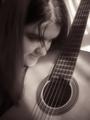
| 12/14/2003 08:41:02 PM |
Curvesby BobsterLobsterComment: I like the capture of the guitar here and the ltght and tones. However, as a study of shape, the face/head distract rather than add. |
| Photographer found comment helpful. |
| 12/14/2003 08:40:03 PM |
|
| Photographer found comment helpful. |
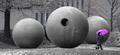
| 12/14/2003 08:39:06 PM |
In the Garden of Globesby magnetic9999Comment: I like this idea, and the desaturation you've achieved. What I think would have really improved this photo is catching her on the way in to the frame rather than the way out. The crop and execution is otherwise excellent. There is still a bit of blue iin the background which would have been nice to get rid of but I understand it's tricky while following the rules! |
| Photographer found comment helpful. |
| 12/14/2003 11:51:53 AM |
Murex Ramosusby timmiComment: Pretty. I think this meets the challenge, and with some flare, but the emphasis here to me is color, not shape! |
| Photographer found comment helpful. |
| 12/14/2003 11:49:49 AM |
Rusted Beautyby edmundtansoComment: Good shot and use of DOF. I think this would have been nice in color or toned to go with the rust theme. Also, it would have been good to try to avoid the darker background detail at the bottom perhaps by shooting upward a bit more. Then you might have even included the top of the wider arc. |
Home -
Challenges -
Community -
League -
Photos -
Cameras -
Lenses -
Learn -
Help -
Terms of Use -
Privacy -
Top ^
DPChallenge, and website content and design, Copyright © 2001-2025 Challenging Technologies, LLC.
All digital photo copyrights belong to the photographers and may not be used without permission.
Current Server Time: 09/02/2025 03:02:23 AM EDT.