| Image |
Comment |
| 01/28/2004 11:00:58 PM |
(The Water Bearer) Aquarius: Let The Sunshine In (But PLEASE, not the moon)by drgsoellComment: Very funny scene; I like the way you caught the sun through the bottle. On the other hand, it might have been interesting to try and make a more unusual statement out of this by cropping and eliminating a lot of the scene details. Not just the crack (which then might seem obscene), but cut his head off, and maybe some of the sides. Anyway, just got my mind wandering... |
 Photographer found comment helpful. Photographer found comment helpful. |
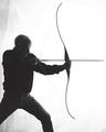
| 01/28/2004 10:56:20 PM |
Sagittariusby weavercComment: Very nice idea and composition. I think this would have been better if you had gone for even higher contrast, so the person was even more a sillouette, and the details on the background on the left were more obscured (that might have taken a fill light though, in addition to the higher contrast). |
| Photographer found comment helpful. |
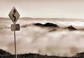
| 01/26/2004 08:20:43 AM |
Cloudy Corners by GringoComment: Beautiful artistic vision of this including a road sign. One of my two top picks for this challenge. A couple of small issues: It would have been good to be able to clone out some of the brighter reflections on the sign (but prohibited by the rules). The horizon of fog appears to be tilted right. |
| Photographer found comment helpful. |
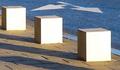
| 01/26/2004 08:17:52 AM |
Cubes and arrowsby mannjuditComment: Excellent abstract visiion of this road sign. This is one of only 2 in this challenge where I have seen true art emerge. Congratulations and good luck. I hope you win! (I hope people don't deduct thinking a painted street sign isn't a sign!) |
| Photographer found comment helpful. |
| 01/22/2004 11:43:01 PM |
Just Before. . .by ShelleyComment: Greetings from the Critique Club!
Hits: This is a wonderfully thought out and executed photo. The natural framing you chose adds great impact to an already beautiful sunset. The bird in the scene, while a little small here, adds to the natural feeling and balance. The exposure looks well done. And the border works well here to frame the photo.
Misses: Not much to criticise here, but one small issue I "THINK" I see, though it's hard to tell at this size, is that the edge of the sillouetted opening looks just a tad softer than you would want the edge to be. That would stand out more in a larger print, but it's also something that could be handled by post processing, if it's even the case at all.
Ideas. Not much I would change here. The only suggestion I would have would be to see if the great asethetics can be improved even more by increase the relative area of the sunset by cropping the top and bottom a little tighter (making it more panoramic).
Great picture overall! |
| Photographer found comment helpful. |
| 01/22/2004 11:30:46 PM |
Night Treeby ColeyComment: Greetings from the Critique Club!
Hits: This is a good night shot; the subject is well exposed (and not overexposed as often happens). The texture of the tree shows very well, and the colors seem right. It's good you chose an off center composition for this.
Misses: The key interest in the photo is the network of branches at the top of the tree. As mentioned, the textures work well, and there's a nice "branching out" feeling. However, aesthetically, it seems to end too abruptly. I think it would work better if you could have gotten more of the branch area of the tree and include a little less of the trunk (assuming your flash would cover it). Perhaps a vertical format would help.
Ideas: One thing you could have tried which I think would have made this really a "stop and analyze" type of photo is a little trick, but legal. What if you were to flip this upside down? I think it would look pretty cool, and there's no rule against it. Maybe next time!
Regards--Neil
|
| 01/21/2004 06:44:39 PM |
|
| Photographer found comment helpful. |
| 01/21/2004 06:43:11 PM |
One Wayby PoobaComment: Good catch of the interesting combinatiuon of the signs. Not sure the perspective shot was important here, but the cloud background works nicely. |
| Photographer found comment helpful. |
| 01/21/2004 06:41:47 PM |
Slow?by kernalklikComment: Excellent and creative idea to pan blur this. Though I'm not sure how you did this, assuming the slow sign wasn't moving for the pan! Whatever, good effect. |
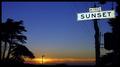
| 01/21/2004 06:40:03 PM |
Sunsetby faidoiComment: Very good idea, and a nice shot overall. It would have been a bit better if you could have found an angle to eliminate the wires. And somehow got a higher angle, e.g., if you have a LCD that moves like on my camera, you could holding your tripod and camera overhead and still compose (if no higher perspective was available). But this is certainly still one of the better road-sign shots! It's hard to make road signs look good. |
| Photographer found comment helpful. |
Home -
Challenges -
Community -
League -
Photos -
Cameras -
Lenses -
Learn -
Help -
Terms of Use -
Privacy -
Top ^
DPChallenge, and website content and design, Copyright © 2001-2025 Challenging Technologies, LLC.
All digital photo copyrights belong to the photographers and may not be used without permission.
Current Server Time: 09/02/2025 07:42:19 PM EDT.