| Image |
Comment |
| 02/02/2004 09:11:57 PM |
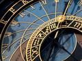
The Astronomical Clock in Pragueby BBBastetComment: This is a magnificent photo, visually. I think you've done it all right. -although it would be nice if it focused on just one of the zodiac signs as per the challenge description. |
 Photographer found comment helpful. Photographer found comment helpful. |
| 02/02/2004 09:11:33 PM |
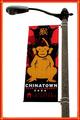
What about the Chinese Zodiac?by mirdonamyComment: Very nice color choices, although without the border your image may fall a little flat. Right now it looks very clean and appealing. and Gong hay fat choy, too. Although considering there's a Chinese zodiac challenge, it'd be nice if you followed the prescribed challenge here... |
| Photographer found comment helpful. |
| 01/29/2004 08:10:51 PM |
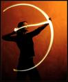
Setting A Heart On Fire by ndsComment: Excellent work - unique, stylish, fiery mood, beautiful. Those two specks on the upper background and blurred left hand might be seen as imperfections, but I wouldn't change this photo at all. If you blew it up, does it stay clear (high-res)? You should win, so I'm giving you my top score for the week. |
| Photographer found comment helpful. |
| 01/29/2004 08:03:20 PM |
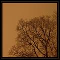
One Tree One Skyby terjeComment: This is a spectacular photo. If it stays this sharp when you blow up the image, i can say it'd be really great. The mood and look here is extremely well-composed. |
| Photographer found comment helpful. |
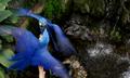
| 01/29/2004 07:51:34 PM |
Gemini twins bicker in the house of Aquariusby ccraftComment: Beautiful and seductive - here you've used bright colors and blur against a dark background very nicely. The dark background here suggests a slight mood of danger or foreboding, though, and I wonder if you intended that. |
| Photographer found comment helpful. |
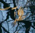
| 01/29/2004 07:49:33 PM |
Abstract on water (Aquarius)by mannjuditComment: This is a great photo that looks better up close than far away, which is opposite many of the other photos you see here. This is a great abstract with lots of details, although I'd suspect that it doesn't look as good blown up. ither way, this is a very good abstract image. |
| Photographer found comment helpful. |
| 01/29/2004 07:37:27 PM |
|
| Photographer found comment helpful. |
| 01/22/2004 08:07:11 PM |
Rue du Champ-de-Marsby mariomelComment: You've captured very nice, bold contrasts. In my personal taste I like this, although I can see how it wouldn't be for everyone. Stick to your own judgment when it comes to what style works in your photos at any given time.. |
| Photographer found comment helpful. |
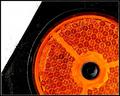
| 01/22/2004 08:06:51 PM |
Orangeby ndsComment: The grittiness of your textures are unique, and your color/geometry composition is very good. Even your border was chosen nicely. This is a photo that I would want to see blown up more to fine detail, because even though it looks so simple from far away, there are all these little shapes and nicks visible up close. Assuming it's very sharp at high resolution, I wouldn't change very much about this photo. |
| Photographer found comment helpful. |
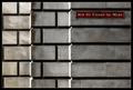
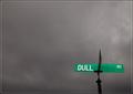
| 01/22/2004 08:03:48 PM |
"Sign of a Dulled Existence"by Nowhere_ManComment: Witty photo that has the look to pull it off. Good job. This is one of the few photos here where a bright and obviously placed sign sticks out in an appealing way, not in an obstrusive or annoying way! It suggests sarcastic commentary to me, which is excellent. Good sarcastic photos are hard to come by. |
| Photographer found comment helpful. |
Home -
Challenges -
Community -
League -
Photos -
Cameras -
Lenses -
Learn -
Help -
Terms of Use -
Privacy -
Top ^
DPChallenge, and website content and design, Copyright © 2001-2025 Challenging Technologies, LLC.
All digital photo copyrights belong to the photographers and may not be used without permission.
Current Server Time: 08/05/2025 09:51:12 AM EDT.