| Image |
Comment |
| 09/13/2003 09:08:04 PM |
|
 Photographer found comment helpful. Photographer found comment helpful. |
| 09/13/2003 09:07:26 PM |
|
| Photographer found comment helpful. |
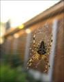
| 09/13/2003 09:03:57 PM |
Resting in the Shadeby mandyg5364Comment: Nice subject, horrible exposure and composition, though. The spiderweb and man-made objects could have been cropped out simply by moving over to the left and down with the camera. With a digital camera, there is no excuse for underexposure, since you can preview your images immediately. |
| 09/13/2003 09:00:25 PM |
Web Building at Sundownby PaulMdxComment: The building in the background is disturbingly tilted. The photo would be better without the building. Looks like it was taken hand-held. |
| Photographer found comment helpful. |
| 09/13/2003 08:58:08 PM |
|
| 09/13/2003 08:56:56 PM |
Cicacdaby DiamondPeteComment: That's a cicada's ex-skin, not a cicada. Not a very challenging subject considering it's nothing but an exoskeleton and can't move. The hair in the picture could have been removed. Depth of field is too shallow. Looks like it was taken under an indoor table lamp, hence the yellowish-red hue. |
| Photographer found comment helpful. |
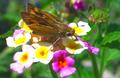
| 09/13/2003 08:51:17 PM |
Blue Eyesby katlynComment: Colors are way off; too blue. You can see the effects of too much jpeg compression. The composition is okay, but would be better if it wasn't "looming over" the subject. |
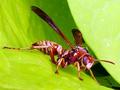
| 09/13/2003 08:47:17 PM |
Waspby fsieradzkiComment: The colors are too saturated and too red, and too much sharpening was applied (look at the antennae). |
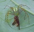
| 09/13/2003 08:43:40 PM |
The Spider and the Beeby ibequeenComment: Blur from camera-shake is evident. The subject is very interesting; I wish we had that species of spider around here. The color fidelity isn't very good. The composition is alright, though. |
| 09/13/2003 08:39:53 PM |
Liquid Lunchby barahooComment: Highlights are blown out. Image lacks color fidelity and looks a little too saturated. |
| Photographer found comment helpful. |
Home -
Challenges -
Community -
League -
Photos -
Cameras -
Lenses -
Learn -
Help -
Terms of Use -
Privacy -
Top ^
DPChallenge, and website content and design, Copyright © 2001-2025 Challenging Technologies, LLC.
All digital photo copyrights belong to the photographers and may not be used without permission.
Current Server Time: 08/23/2025 04:53:35 AM EDT.