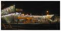
| Image |
Comment |
| 10/09/2003 11:05:04 PM |
|
 Photographer found comment helpful. Photographer found comment helpful. |
| 10/09/2003 11:03:03 PM |
Lonelyby mannenComment: The composition is effective and I can see the man sitting there all alone. The only thing that is bothersome is the fringing on the white lights. I don't know how you could improve that short of getting a better lens. 7 |
| Photographer found comment helpful. |
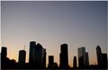
| 10/09/2003 10:58:32 PM |
Downtown at sunriseby CamComment: It looks blurry. Like the colors. A little too much negative space, would have been ok if there were some beautiful clouds up there. |
| Photographer found comment helpful. |
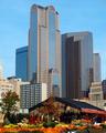
| 10/09/2003 10:54:29 PM |
Washington Reflectionsby kostiaComment: The right half is sorta wasted. Would like to have seen the building taking up a little more of that space. Good focus and perspective. |
| Photographer found comment helpful. |
| 10/09/2003 10:40:34 PM |
|
| 10/09/2003 10:35:47 PM |
|
| 10/09/2003 10:34:46 PM |
DUCK!by solarysComment: If this did not have motion blur, it would be a bit better. Also the composition doesn't work. Try to not center your subject. I think, if you had gotten closer to the mirror, so that it filled the frame better, you could have gotten more details of the outside world you were trying to capture. |
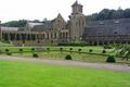
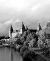
| 10/09/2003 10:28:36 PM |
Belgian trappist monastery breweryby InfinityComment: Perfect composition for this building and grounds. The lack of contrast makes the picture look more boring than it needs to be. Too bad you couldn't clone out the tree on the right. |
| 10/09/2003 10:24:26 PM |
|
| Photographer found comment helpful. |
| 10/09/2003 10:21:37 PM |
The Webby RockComment: The more of this type of picture, the more I get the feeling that they are really hard to get the right balance between busy and boring. Admire the attempt. I would have maybe cropped it square, using the top portion. |
| Photographer found comment helpful. |
Home -
Challenges -
Community -
League -
Photos -
Cameras -
Lenses -
Learn -
Help -
Terms of Use -
Privacy -
Top ^
DPChallenge, and website content and design, Copyright © 2001-2025 Challenging Technologies, LLC.
All digital photo copyrights belong to the photographers and may not be used without permission.
Current Server Time: 08/24/2025 11:04:41 PM EDT.