| Image |
Comment |
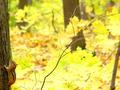
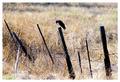
| 10/24/2003 08:11:13 AM |
Food searchby grosmongolComment: hahaha. I was following the in-focus branch down down down as the picture loaded, got caught on the contrast between that limb and the one behind it that's not focused, got to the bottom, scratched my head, and then finally looked around. I think your subject is a little misplaced.
Beautiful colors. Enjoyed looking at it, so I apologize if you don't find this helpful. |
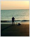
| 10/24/2003 07:58:06 AM |
nursing a beerby ursulaComment: I can see his arm. Would be better if it was a little more in focus or maybe show his hand. I like the warmth of the toning. I apologize about not having more positive things to say. |
 Photographer found comment helpful. Photographer found comment helpful. |
| 10/24/2003 07:52:21 AM |
|
| 10/24/2003 07:49:00 AM |
Miss Van De Roheby swaroskjiComment: Very diffierent. I like the colors and clarity. Excellent use of lines and space. She seems a little crowded on the bottom edge. I hope you left notes on the picture saying why you framed this in this manner. |
| Photographer found comment helpful. |
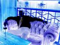
| 10/24/2003 07:39:12 AM |
Feeling Blueby michael_pComment: You had a good idea here. This gentleman is sitting all alone, the poster indicates he is in a location where people can meet others such as a bar or lounge. I don't see anything so wrong with the picture that you had to resort to such a harsh color treatment. There must have been a more elegant way colorize it. Right color, wrong treatment. |
| Photographer found comment helpful. |
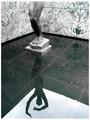
| 10/24/2003 07:14:49 AM |
Alone in a bathroom..by ScantyNebulaComment: It's like looking thru a window. I would not have known this was a bathroom unless you said it. I like how she is just a small part of the image, her placement is ok too. If you don't mind a suggestion, if you could raise your camera a bit, you could eliminate the white of the ceiling and get a more straight on perspective on the mirror. I think that would create a stronger illusion. |
| Photographer found comment helpful. |
| 10/23/2003 09:14:13 PM |
Lonerby TarbiniComment: I am giving you a 7 because I like the desolation and abandoned feeling of this. Really a good capture with lots of visual interest.
If I were voting on quality, I would not rate this high. I don't like whatever happened to the background, it's not blurred like a lens would do. I suspect neat image. The area to the right is also like that. |
| Photographer found comment helpful. |
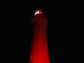
| 10/23/2003 08:55:50 PM |
Lighthouseby bubonoceleComment: The red is really beautiful against the black sky. Two questions. What is that red patch up at the top? Did you try it in portrait position? I really have to fight to get my eyes to look away from the patch. |
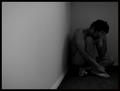
| 10/23/2003 08:45:26 PM |
Breakdownby TooCoolComment: Good job. Really makes me feel enclosed, edgy, with my back to the wall. Really well done. |
| Photographer found comment helpful. |
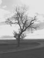
| 10/23/2003 08:40:45 PM |
Dead Treeby divineinspirationComment: Monitor problem? I hate when that happens. Good composition. I'll go ahead and score it as if there wasn't a problem. 7 |
Home -
Challenges -
Community -
League -
Photos -
Cameras -
Lenses -
Learn -
Help -
Terms of Use -
Privacy -
Top ^
DPChallenge, and website content and design, Copyright © 2001-2025 Challenging Technologies, LLC.
All digital photo copyrights belong to the photographers and may not be used without permission.
Current Server Time: 08/25/2025 03:57:29 PM EDT.