| Image |
Comment |
| 06/02/2008 09:29:56 AM |
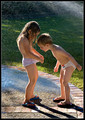
The Innocence of Youthby FotoMunkiComment: I can't believe I didn't snag this as a favorite before. What was I thinking? A perfect moment captured of young innocence. |
 Photographer found comment helpful. Photographer found comment helpful. |
| 05/26/2008 02:17:54 PM |
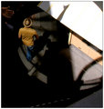
dictate my life.by ShannonLeeComment: Almost feels like he has angels watching his every move. The hand and the shadow on the white wall(looks like an upraised arm) turn this into a very special moment. For some reason, it reminds me of, don't laugh, an old master's religious painting. |
| Photographer found comment helpful. |
| 01/08/2008 10:41:39 AM |
The Spagetti Phillosopherby TimComment: I'm a messy icky hater type so I'll comment on this. The thing is most people have seen/raised kids. They have seen them snotty nosed, messy, sick, happy, angelic and all the other kid stuff. They have their own treasure trove of pictures just like this one. So....I guess it's not a unique picture. I know, it has been said that nothing is unique, but look at winning entries of children and I think you will see the difference between this and those right away. There is something in the others that draws the viewer into the scene. Something that clicks emotionally.
However it is really well taken. As a portrait, I like the lighting and his/her little hand up by the cheek. I like the fill-the-frame crop(well, I'd like a little more room around the baby, especially over on the right of the frame) and the detail in the hair and the color is perfect. You did a good job but I really don't think messy kids are that cute. Lucky I didn't vote but this opinion might be carried by other voters.
I'd get rid of whatever that white ring is behind the baby. Direct eye contact might be good too. |
| 01/08/2008 10:17:33 AM |
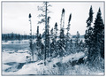
Winter Bluesby AlainComment: The cut off tree runs almost in the center of the frame. So it has cut it into two sections. That is the first thing I notice. I wasn't there so I don't know if it was possible for you to move over more towards the left of the picture, but that seems to be a better spot to get the group of trees out of the center. I want to see the river and the trees are blocking my view. The color is good but not enough of a draw to overcome the flawed composition which is made unbearable by the cut off tree. Eventually that is all I can see in the picture. It's a real shame because it is a lovely place. |
| Photographer found comment helpful. |
| 01/08/2008 09:59:18 AM |
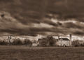
Riding Farm on the Stormby SoulMan1978Comment: Agree with the others. You did a nice job bringing out the tones without creating a lot of noise but the blur in the clouds is to much. Also the blur in the trees is not convincing. The one on the right of the frame almost looks like there was a drop of water on the lens. The one right by the chimney. It's an interesting scene and I think it would have done better with a more subtle post processing approach. |
| Photographer found comment helpful. |
| 01/08/2008 09:29:57 AM |
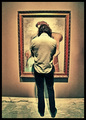
Art Appreciationby HipychikComment: I think you could have turned some of the 5s to 6s if there had been a perspective and barrel distortion adjustment done to the picture. The noise doesn't seem to have been to much of a distraction. The only part I don't like is the hardness of the noise under the frame and between his legs. It's different than the softer noise all around. Because it's different, my eyes are drawn to it. Hope you try the perspective adjustment. |
| Photographer found comment helpful. |
| 01/08/2008 09:04:55 AM |
Burj Al Arab at sunsetby signal2noiseComment: The colors, the sky, the beautiful building and the person all are good. It should add up to a pleasing picture with a good score. I think there is to much distance to the first object in the frame which would be the person. Although you have all these splendid parts, they are to small to enjoy. A longer lens would have created a different spacial relationship altogether and given you(us) a closer look at the details. Using the same lens that you did would have been ok also, but I think it would have been better to get closer to the person. Personally, I'd like to see the sun as a larger object and that would require a longer lens. |
| Photographer found comment helpful. |
| 12/26/2007 12:47:02 AM |
Neela 1.jpgby dssagent88Comment: She's cute. Good job catching a smile and a good pose.
You might want to check the white point. It seems to have a heavy blue tint. |
| Photographer found comment helpful. |
| 12/08/2007 01:47:21 AM |
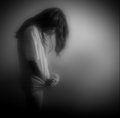
nothingby silverfoxxComment: When I look at this, I think of this. 
Yours just seems to be the anthesis of it. Youth and joy opposed by empty...What a powerful statement they make together. It's uncanny how the two females are in the almost exact same pose but are exuding such different moods. |
| Photographer found comment helpful. |
| 11/09/2007 09:42:23 PM |
|
Home -
Challenges -
Community -
League -
Photos -
Cameras -
Lenses -
Learn -
Help -
Terms of Use -
Privacy -
Top ^
DPChallenge, and website content and design, Copyright © 2001-2026 Challenging Technologies, LLC.
All digital photo copyrights belong to the photographers and may not be used without permission.
Current Server Time: 06/30/2026 06:43:49 PM EDT.