| Image |
Comment |
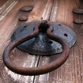
| 05/19/2010 05:41:32 AM |
old church 's door knobsby lh4mComment: The picture seems bottom heavy, next time if something is hanging downwards (like the handle, in your case) place the weight in the top half so that your eye moves down the picture and there is still space for your eye to move. |
 Photographer found comment helpful. Photographer found comment helpful. |
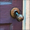
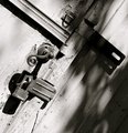
| 05/19/2010 05:39:26 AM |
Sprungby crikComment: I would have liked it better if you placed the door knob more in the top left hand corner, its a bit too centered. |
| Photographer found comment helpful. |
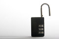
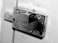
| 05/19/2010 05:36:59 AM |
Master Lockby injenn00Comment: There isnt enough detail in the actual lock, looks a bit washed out. If your lock was sharper with more light on it, it would have done better. |
| 05/19/2010 05:35:42 AM |
Entrance to the great templeby fionafsComment: Nice interesting door, but the blown exterior on the right is distracting, my eye drifts from the door handle to the white on the right and then back again to the door handle. Creates too much distration, perhaps if the outside wasnt as bright it would have been more pleasing to the eye. |
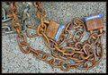
| 05/19/2010 05:33:07 AM |
Long Forgotten.by cablondeoneComment: Nice colours but the chains in the top left corner are distracting, they draw my attention away from the focal points in blue. So the photo seems confusing. |
| Photographer found comment helpful. |
| 05/19/2010 05:31:31 AM |
Handle or Knob?by banmornComment: Grey tones are very nice. One thing, if you try centre the photo then make sure its in the centre exactly the photo seems a little off to the right. |
| Photographer found comment helpful. |
| 05/19/2010 05:30:10 AM |
Set It & Forget Itby KelliComment: The blurred leaf/small branch in the bottom right foreground is distracting because its out of focus, maybe if its wasnt there at all the photo would have been better. |
| Photographer found comment helpful. |
| 05/19/2010 05:25:52 AM |
weatheredby GinaRothfelsComment: Could have done a bit more with the composition instead of just centering it. |
| Photographer found comment helpful. |
| 05/19/2010 05:24:19 AM |
Halfway Thereby butterntoast43Comment: Be careful of the angle, if its too far over, e.g past the 45 degree it may appear as though your picture is falling over. |
| Photographer found comment helpful. |
| 05/12/2010 09:00:11 AM |
|
| Photographer found comment helpful. |
Home -
Challenges -
Community -
League -
Photos -
Cameras -
Lenses -
Learn -
Help -
Terms of Use -
Privacy -
Top ^
DPChallenge, and website content and design, Copyright © 2001-2025 Challenging Technologies, LLC.
All digital photo copyrights belong to the photographers and may not be used without permission.
Current Server Time: 08/24/2025 09:24:25 PM EDT.