|
|
|
Showing 1211 - 1220 of ~1797 |
| Image |
Comment |
| 09/06/2014 09:12:02 PM | Soviet Brideby Dr.ConfuserComment: Critique Club Comment
A refreshing take on the challenge, which seemed to be full of fantasy more than surrealism. I enjoyed the creative titling and was impressed to see this is an iPhone image. I also like the subtle color palette and the graceful interplay of the the arcs that define the lines throughout the image. Well done. |  Photographer found comment helpful. Photographer found comment helpful. |
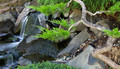
| 09/06/2014 09:03:20 PM | A place for reflectionby gminkComment: Critique Club Comment
Hi Gaylord,
There's some nice technical work here. The image is sharp with strong color, and lovely motion blur in the water. The tonal range is good with a full range of shadow to highlight.
What isn't working so well for me is the composition. The image is very busy compositionally. I find my attention jumping from the lovely curving lines of the tree on the right, to the the bright green foliage in the center, to the soft flowing water on the left. Each part works well independently, but not so well together as one cohesive scene. In summary, I find this to be a technically excellent image that would be improved with a more isolated single point of attention. |
| 09/06/2014 08:53:09 PM | Velociraptor: A dominant species who predated Homo sapiensby RyanWComment: Critique Club Comment
Hi Ryan...
This photo does well with the unique take on the Time Capsule challenge theme and there are some very positive things going for it technically. Considering your notes, I'd imagine you were using the 70-300 hand held and with a shutter speed of 1/80, this is a really sharp image. Add ISO 6400 to the mix and this is really a terrific demonstration of a steady hand and good noise reduction processing. But the scoring wasn't where you expected - BTW, I'm one of the 5's.
There are a few things that detract from the subject matter for me. First is the composition- primarily the the awkward tail crop as you noted above. I also would like to see a bit of opening up in the shadows and highlights - the brightest spots are in the background at top of the frame and draws my attention away from the subject, while the detail of dino faces are lost in the shadows. The change in color temp (from different areas of the scene having different gels in the theater lighting, I suspect, also creates a split in color temp just above the midline.
Based on the limitations you had to work with, it's a good representation of a moment in the performance, but not a knockout photo. It fit the challenge theme and made me think about what you were conveying and on that level, it worked well. Message edited by author 2014-09-07 16:31:37. | | Photographer found comment helpful. |
| 09/06/2014 02:44:55 PM | Where Dreams Come True....by Ja-9Comment: Critique Club Review
A wonderful subject for the challenge, well composed and definitely suitable to the square crop. The composition is really well balanced with spires to the left and right and the castle providing the perfect backdrop. Lines from the tracks and the background tableau lead nicely to the foreground subject. The tonal values are good (a bit dark in the shadows and a bit over-saturated for my taste).
What really stops this from being more appealing for me is the overall busyness of the midline background. I know there's no way to avoid people at Disney World, but in this case the background directly behind the car and its passengers keeps the main subject from really standing out. I keep looking at the headlights and the tires, because they are more isolated from the background. It seems from your notes that you know your way around some good post-processing tools - you might consider looking at some selective exposure control to help make the main subject pop out of the background. A Camera Raw radial filter on the car or a overall exposure reduction with a Viveza control point to brighten the car might be an interesting option.
All that said, I like the image a lot. My suggestions are based only on that one minor issue I see - a wish to isolate the subject from the busy background at mid-frame. Excellent work overall - especially in the context of the challenge.
| | Photographer found comment helpful. |
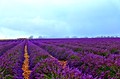
| 08/27/2014 09:42:11 PM | Revealing Purple within Natureby Edwardho94Comment: Critique Club Comment:
Hi Edward and welcome!
Initial Impression: Like several commenters, I initially reacted to the tilted horizon. But, as I look at it more carefully, I'm wondering if your point of view includes a rolling, gentle slope. Hard to tell, but even if it is, the first reaction is likely to see a tilted horizon. Beyond that aspect (and the close to center placement of the horizon), there's a lot interesting stuff going on here. It caught my eye and kept me looking.
Color: You've definitely got some excellent purple going for you! I've never seen a lavender field up close, but I think there are a few around where I live - I'm going to be looking for sure. I find the intense saturation of the flowers and the orange-brown material between the rows - is it gravel, rock, or some kind of mulch? - to be a bit distracting. The color of the sky seems a bit incongruous to the foreground, too; likely an artifact of the HDR process. I suspect the clouds were more grey than the blue cast you show here.
Composition: I've already mentioned the ambiguity of the horizon line (tilted or rolling hill?) and the overall centering of the horizon in the frame. When I set those two questions aside, I see good design in the composition - I'm particularly drawn to the straight vertical line on the left and the way it draws my attention to the clouds on that side of the image. I find myself focusing my attention on the left side - the right side seems to almost fade to periphery. I think this is actually an effectively balanced composition.
Technical details: I'm not a fan of this style of HDR processing. As amazing as the technical effect of merging multiple exposures can be, it doesn't always produce an overall pleasing effect when done with too little subtlety. Finally, your selection of f/2.8 limits the depth of field enough to create a distracting blur in the extreme foreground and a sense that there's really very little that sharp throughout. - this lack of sharpness may be amplified by the merging of multiple exposures, too - especially outdoors when even slight breeze can be enough to move the lavender between shots.
Overall: Despite all the specific suggestions, I do find this to be an attractive image. I scored it as a 6 during voting. For me that means it caught my attention in a good way. There's a lot to like. Nice work.
BTW... Since this is apparently only your second entry here, let me point you to this thread in the forums. Your score of 5.9xxx qualifies you to be a recipient of the world's tiniest violin award - for images that are "Almost-But-Not-Six" At this rate your break the 6+ threshold no time! |
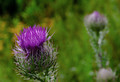
| 08/27/2014 03:22:45 AM | Prickly Purpleby KMcCComment: Critique Club Commentary:
On initial impression, I'm attracted by the detail and color of the front flower and the mirroring of the blurred secondary background subject.
On further viewing, I'm seeing good detail, focus and dynamic range in the front flower, but I become slightly distracted by the darkness in the upper left corner and the splashes of yellow behind the front flower.
Compositionally, the strong diagonal line created between the flowers draws my attention appropriately between the foreground subject and the mirrored background subject. I'd like to see a bit further down the stem of the foreground subject, which seems to be sitting right on the bottom edge of the image. Finally, the distance between the two subjects may be a bit extreme, with a tendency to push both subjects too far toward the corners.
The light is fairly soft and provides even coverage, but seems a bit flat - perhaps in need of more contrast/highlights.
Overall it is an appealing image that succeeds on first impression and provides interest and composition to hold attention and encourage a longer look. Message edited by author 2014-08-28 19:48:14. | | Photographer found comment helpful. |
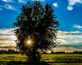
| 08/27/2014 02:36:27 AM | Abandoned in the middle of nowhereby clickodakComment: Hi Marcel,
I'm new to the Critique Club and this photo came up as one of the first for my critique.
This is a bold and dramatic image. Shooting directly into the light with the placement of the sun/sunburst behind the tree creates a striking center of attention. It also defines a very difficult lighting tableau to photograph effectively. I think you've attempted to address the challenging light with HDR processing.
For my taste, the overall intensity of the processing is too extreme and creates several competing elements that seem to be vying for attention. For example, the deep blue sky at the top of the frame accentuates the HDR halo effect behind the tree. There is also a dramatic color temperature shift from the deep cool blues at top of the sky to the golden warmth of the clouds on the horizon and the crop directly behind the tree, which feels quite unnatural to me. While there are several interesting aspects to the scene, I just can't seem to grasp it as a whole, cohesive image.
A note about the composition - You've placed the sun almost exactly at the lower left intersection of traditional "rule of thirds" lines. I think that combining the brightest area of the image with this powerful compositional positioning tends to bring the viewer's eye to rest directly on the sunburst and places great weight on the lower left corner of the image.
All that said, I understand that your intent may have been to express the intense drama and variety of light throughout the scene - you've certainly done that. It's full of color and passion. Personally, I find the warm yellow-green color and highlights of the crop growing behind the tree to be among the most attractive part of the scene. When taken as a single isolated component of the photo, I think it's a very pleasing bit of processing.
| | Photographer found comment helpful. |
| 08/26/2014 11:07:59 PM | Checksby MAKComment: Sultry and mysterious. Perhaps a bit heavy on the skin softening. Nice. | | Photographer found comment helpful. |
| 08/26/2014 11:05:41 PM | Amethystby naomikComment: This is fascinating. A unique perspective and fabulous technical control. I'm not sure why the purple seems to work, though. But it does, so... I'll just live with it and enjoy. | | Photographer found comment helpful. |
| 08/26/2014 11:01:24 PM | Edged in Purpleby banmornComment: I'm not sure how many big bold flower close-ups I can handle and still keep liking them so much. I really don't like flower photos that much at all... Yeah... that's my story - I'm sticking with it. Really. Really nice. | | Photographer found comment helpful. |
|
Showing 1211 - 1220 of ~1797 |
Home -
Challenges -
Community -
League -
Photos -
Cameras -
Lenses -
Learn -
Help -
Terms of Use -
Privacy -
Top ^
DPChallenge, and website content and design, Copyright © 2001-2025 Challenging Technologies, LLC.
All digital photo copyrights belong to the photographers and may not be used without permission.
Current Server Time: 08/11/2025 03:38:45 PM EDT.
|