| Image |
Comment |
| 10/08/2003 03:18:14 PM |
|
| 10/08/2003 03:16:29 PM |
|
 Photographer found comment helpful. Photographer found comment helpful. |
| 10/08/2003 03:14:33 PM |
|
| Photographer found comment helpful. |
| 10/08/2003 03:13:39 PM |
|
| Photographer found comment helpful. |
| 10/08/2003 03:12:31 PM |
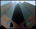
Eyes to the Skyby dsidwellComment: Very good - takes advantage of the converging verticals. Colour are a bit flat but on balance nice overall. |
| Photographer found comment helpful. |
| 10/08/2003 03:10:31 PM |
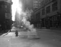
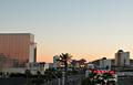
Casino Driveby sfarrell23Comment: Would be more exciting if you cropped the top third off - way too much sky for my liking. A tighter crop would have given a greater feeling of it meeting the challenge. |
| 10/08/2003 03:09:05 PM |
|
| Photographer found comment helpful. |
| 10/08/2003 03:08:13 PM |
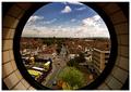
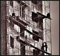
Painting the urban landscapeby ChezComment: Nice. But IMO could do with the right hand side being cropped tightly to the scaffold, I find my eye "slipping off the edge" of the subject. |
| Photographer found comment helpful. |
| 10/08/2003 03:06:22 PM |
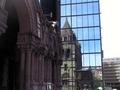
Old and newby carinaComment: I like this very much but (sorry) I think it could benefit from a crop of the distracting building on the right hand side. Yes, I can see that that would emphasis the converging verticals and as perspective correction is not allowed!!!
I wonder if a slight shift in viewpoint could have done it. |
| Photographer found comment helpful. |
| 10/08/2003 03:03:16 PM |
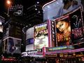
New Yorker Hotelby jtnyComment: Like the idea but the blcked out shadows lower third and the mesh pattern over the whole image do rather take away form what is a nice composition. |
| Photographer found comment helpful. |
Home -
Challenges -
Community -
League -
Photos -
Cameras -
Lenses -
Learn -
Help -
Terms of Use -
Privacy -
Top ^
DPChallenge, and website content and design, Copyright © 2001-2025 Challenging Technologies, LLC.
All digital photo copyrights belong to the photographers and may not be used without permission.
Current Server Time: 08/04/2025 02:48:40 PM EDT.