| Image |
Comment |
| 04/28/2010 06:54:22 PM |
|
 Photographer found comment helpful. Photographer found comment helpful. |
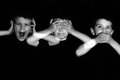
| 04/28/2010 06:51:37 PM |
hear no evil, see no evil, speak no evilby JdroullardComment: The only distraction here are the crossings between the different exposures. Don't know if you tried a triangular composition instead of a linear one, maybe it would have worked as well? The facial expressions are great. |
| Photographer found comment helpful. |
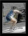
| 04/28/2010 06:49:42 PM |
Catch This!by sjmflashComment: This is too blurry and has a lot of artifacts. The borders are soft as well. Leaves me with an impression that this photo was resized from a much smaller photo format. I'm not sure if i'm seeing selective desaturation, but it definitely brings those artifacts to light. |
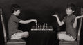
| 04/28/2010 06:46:47 PM |
Stalemateby bcrantsComment: Great idea and a great photo. I really like how the final lighting looks like, and b&w really works for this. |
| Photographer found comment helpful. |
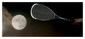
| 04/28/2010 06:40:34 PM |
Planetary defenseby duartixComment: The moon is a little disproportionate to the racket. Original idea and nice execution. |
| Photographer found comment helpful. |
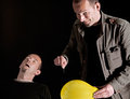
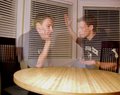
| 04/28/2010 06:36:00 PM |
Pause in the argumentby mercaptanComment: The subject(s) are too transparent, i think, and the facial expression on the right one is just too calm to be in an argument. His right hand looks more like he's going to hit the other guy than like he's in an argument. I learned the hard way (in this challenge) that in order to have the subject less transparent, you have to have the background as dark as possible, and the subject as well lit as possible. |
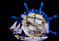
| 04/28/2010 06:24:39 PM |
Sailing Ahead of the Weatherby BrianRComment: The center point of the subject is just too busy to look at. Nice idea, though. I love the intensity of the blue color on this one. |
| Photographer found comment helpful. |
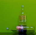
| 04/28/2010 06:22:31 PM |
More for me!by MaartenvanastComment: Great wall colour and just the right exposure, the label on the horizontal bottle draws attention to it as it looks much more realistic than the rest of the two bottles. For some reason the composition doesn't work great for me, but i really have no idea why. Also, i don't understand the connection between the title and what's on the photo. Good luck :) |
| Photographer found comment helpful. |
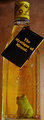
| 04/28/2010 06:16:01 PM |
What worm?by drydocComment: I love the idea behind this one. The label is a little distracting and the crop on the right side at least could have been a bit wider to avoid it touching the label edge. The frog's expression is priceless :) |
| Photographer found comment helpful. |
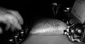
| 04/28/2010 06:13:38 PM |
untitledby jonksterComment: I have mixed feelings about this one. The composition without the hands would have been perfect for my taste, the lighting is great, but the hands are too blurry and remind me more of someone typing really really quickly more than of a double exposure. I'm not sure if you used a flash for this one, but a secondary flash to light up the hands would have eliminated what looks like motion blur on them. |
| Photographer found comment helpful. |
Home -
Challenges -
Community -
League -
Photos -
Cameras -
Lenses -
Learn -
Help -
Terms of Use -
Privacy -
Top ^
DPChallenge, and website content and design, Copyright © 2001-2025 Challenging Technologies, LLC.
All digital photo copyrights belong to the photographers and may not be used without permission.
Current Server Time: 08/03/2025 10:33:30 PM EDT.