| Author | Thread |
|
|
05/08/2010 07:35:44 PM |
|
The concept here is good. It just needed a little more control. |
|
Comments Made During the Challenge  |
|
|
05/03/2010 09:40:50 AM |
|
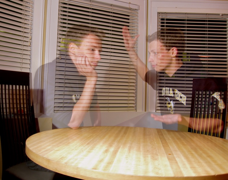
I like this photo; even the 'off kilter' camera angle seems to work here. Great placement of what i assume to be yourself. Only thing i would improve on is on the person to the left. His right eye seems to have like a dot and its a huge contrast and my eyes went right there when i saw the pic. Overall very nice; i imagine you used the bulit in flash for the pic; but maybe try usinga difusor on it or a smaller aperature because the table is just a bit brighter than it should be; and you would get rid of a little bit of the background bringing our your subjects. Nice shot. 7 |
|
|
|
05/02/2010 01:04:48 PM |
A really good idea here, but I feel the execution lets it down a bit. I note you have exposed the image for the surrounds, and presume you had a long exposure that allowed you to move positions. The negative that always comes with that method is the ghosting that occurs, and here the bright (and busy) background showing through does effect the overall result.
The use of flash in these cases (flash, change position, flash again) usually gives better results, as does being on a dark background so that there is less effect on your image.
But a great try at it.
Also, I am sure others have noticed, the image is tilted......... |
|
|
|
04/29/2010 04:46:50 AM |
Both the images of you have ghost effect.
You should have controlled the light settings more for a better picture |
|
|
|
04/28/2010 06:36:00 PM |
|
The subject(s) are too transparent, i think, and the facial expression on the right one is just too calm to be in an argument. His right hand looks more like he's going to hit the other guy than like he's in an argument. I learned the hard way (in this challenge) that in order to have the subject less transparent, you have to have the background as dark as possible, and the subject as well lit as possible. |
|
|
|
04/28/2010 03:43:57 PM |
|
i'm seeing double with these. |
|
Home -
Challenges -
Community -
League -
Photos -
Cameras -
Lenses -
Learn -
Help -
Terms of Use -
Privacy -
Top ^
DPChallenge, and website content and design, Copyright © 2001-2026 Challenging Technologies, LLC.
All digital photo copyrights belong to the photographers and may not be used without permission.
Current Server Time: 06/29/2026 07:30:36 AM EDT.