| Image |
Comment |
| 03/31/2010 04:04:06 PM |
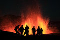
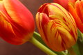
Infernoby orvaratliComment: One of the more interesting volcano shots. I love the colors and the millions of little dots of lava.
But I really really feel like the people should have been in sharper focus. Especially the two blurry ones on the left are very distracting. It is the people's silhouettes that make this photograph interesting and sets it apart from the other volcano shots, so the fact that they are not all in focus is a downer. For me, it makes the difference between giving you a 6 and an 8. |
 Photographer found comment helpful. Photographer found comment helpful. |
| 03/31/2010 04:01:00 PM |
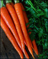
Carrot Orangeby grahamgatorComment: Good contrast between the orange carrots and the green leaves.
I would have liked to see the tips of the carrots on the bottom (or cropped more tightly so it is not as obvious that only the very tips are missing). This way, I find myself just staring at the bottom edge of the photo. |
| Photographer found comment helpful. |
| 03/31/2010 03:58:43 PM |
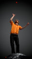
Orange (CW)by tehbenComment: Interesting picture and good use of orange. But what is he standing on?
I really love the shirt, it is in good focus and an orange that is very pleasing to the eye.
However, I also feel like the orange ball in the bottom left is distracting, and that the vignetting just darkens the picture a lot. |
| Photographer found comment helpful. |
| 03/31/2010 03:56:44 PM |
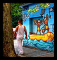
Don't Worry....Be Happy! by the99Comment: I think this image would have worked better if either the person was in sharper focus, or there was no person.
Cute drawings :-) |
| Photographer found comment helpful. |
| 03/31/2010 03:55:43 PM |
The Riverfront at Sunsetby GatorguyComment: The boat seems a little soft to me.
I like the line and the pieces of wood in the water, that forcefully lead to the subject. The building are also a nice shade of orange. |
| Photographer found comment helpful. |
| 03/31/2010 03:54:11 PM |
The striped outcastby giantmikeComment: Beautiful flower and crisp detail, but I don't know about the composition chosen here. There is nothing specific I can suggest for improvement, but I suspect this might have stood out even better with a different one. 6 |
| Photographer found comment helpful. |
| 03/31/2010 03:53:11 PM |
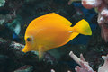
Shades of Orangeby jimsappComment: The fish in the background distracts me away from the main fish a little. I can't decide whether I dislike that, or if I think that it adds an element to the picture. I guess I am neutral to this picture. |
| 03/31/2010 03:49:18 PM |
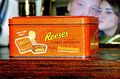
Hmmm Hmmm Goodby whiterookComment: The picture frame in the background of this picture completely distracts away from your main subject.
It is to the point that I practically do not look at the main subject in favor for that. |
| 03/30/2010 10:09:43 PM |
Childhoodby northeboundComment: The coloring of this photo is a little strange. While the sweater is orange, the rest of it appears very purple. I think I would have like this better with a more natural tinge. I like "the little engine that could" in the corner. My eye keeps bouncing back between the person and that book. |
| Photographer found comment helpful. |
| 03/30/2010 10:07:37 PM |
|
| Photographer found comment helpful. |
Home -
Challenges -
Community -
League -
Photos -
Cameras -
Lenses -
Learn -
Help -
Terms of Use -
Privacy -
Top ^
DPChallenge, and website content and design, Copyright © 2001-2025 Challenging Technologies, LLC.
All digital photo copyrights belong to the photographers and may not be used without permission.
Current Server Time: 08/04/2025 01:28:58 PM EDT.