DPChallenge: A Digital Photography Contest You are not logged in. (log in or register
 
Browse Settings
Currently viewing:
Registered Usertrain

Show comments:

Per page:

Order:

Comments:


Comments Made by train
Pages:   ... [263] [264] [265] [266] [267] [268] [269] ... [384]
Showing 2651 - 2660 of ~3833
Image Comment
A subtle patience
08/23/2004 02:22:01 AM
A subtle patience2nd Place
by heida

Comment:
This is a beautifil image I love the lighting on her face and the glow on her
Very professional shot and detail and everything about this is very tastful
Love the shine on her hair
My favorite opf the challenge 10
Photographer found comment helpful.
Peaceful
08/23/2004 02:06:47 AM
Peaceful
by menardmam

Comment:
I like the effects you have used on this very nice
Photographer found comment helpful.
Radiant
08/23/2004 12:25:18 AM
Radiant1st Place
by Mary Ann Melton

Comment:
well done Mary! a beautiful image and deserved win
Congrats
Photographer found comment helpful.
Falling
08/19/2004 03:09:25 AM
Falling3rd Place
by heida

Comment:
I love the tonal values of your work You are very artistic. Congrats on the ribbon

Message edited by author 2004-08-19 03:10:44.
Photographer found comment helpful.
It's Freezing!
08/19/2004 03:01:51 AM
It's Freezing!1st Place
by EddyG

Comment:
Congrats on your ribbon A well deserved win! I love the blue
Photographer found comment helpful.
Damselfly
08/09/2004 02:50:49 AM
Damselfly1st Place
by Jacko

Comment:
Congrats Jacko I think your shots are awesome
I think Id rather have this on my wall than the fly though That fly is one ugly face.
How do you get so close?
Photographer found comment helpful.
Diggin' Poppin' Cookin' - Sixty
08/08/2004 11:21:23 PM
Diggin' Poppin' Cookin' - Sixty
by Herblacklist12

Comment:
Hi Robert from the Critique Club

I think looking at your score and your comments that the voters did like this image
It is very interesting and I agree with the voters about the ciggarettes
I think the image would have been just as good if not better without them
I just love the saxaphone and the suit and tie is great.A nice elegant image nicely presented for a Jazz c d Black and white great
Focus detail and crop are all fine
So I can't really find any thing negative about this image just all positive. Well Done

There were a lot of excellent images in this challenge and you received a very presentable score. I hope you continue to enjoy your photography and good luck in your future challenges
If you have any questions please feel free to PM me
Regards
Sally
Photographer found comment helpful.
Druids (of the) Pagan Church
08/05/2004 05:54:30 AM
Druids (of the) Pagan Church
by Tallbloke

Comment:
Hello Steve from the Critique Club

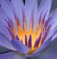
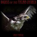
Well! what can I say. So near and yet so far. What a shame because the score is very high This is an amazing image so beautiful and you have captured it so well. Beautiful lighting and focus.
Your score is excellent and only just missed the ribbon
For myself I would choose yours as a ribbon winner but I am only one vote and there can be only 3 ribbons
Good title for a rock band
Myself I am not keen on the style of font used but, hey, who really looks at the font when you have a great image but the voters comments say they like it with a few exceptions
Its just a shame you missed out but that's no reflection on your image
Keep the good work coming our way and you will surely be a ribbon winner.
Nice work Enjoy your photography Good luck in future challenges
If you have any questions please feel free to PM me
Regards
Sally

Photographer found comment helpful.
Deezuumeraa Piggybank Clanisaus
08/05/2004 05:40:01 AM
Deezuumeraa Piggybank Clanisaus
by frychikn

Comment:
Hello John from the Critique Club

I havent a clue what the title stands for but I do like the style of words you used (The font) it looks like text on a rock album

You have used too many objects with very different patterns and it makes me almost dizzy trying to look at it.
I like the two faces you have in your image and I think it would have helped if you focused on them with a plain background and left the other items out.
A plain background would also make your text stand out.

It seems unfair to vote you so low when you have obviously tried the colour is good ,but please try to remember that simple is sometimes better and there were a whole lot of excellent images in this challenge, and D P C have a very high standard
I hope that you will continue to enjoy your photography and have better luck in your future challenges
If you have any questions please feel free to P M me
Regards
Sally
Photographer found comment helpful.
Dead Peoples Club
08/05/2004 05:26:52 AM
Dead Peoples Club
by MAK

Comment:
Hello Marac from the Critique Club

This is a wierd sort of image. I like it very much yet it is quite spooky with that head sort of just hanging there (I am not going to look at it any more I have to go to bed soon! LOL!)

The guitar does look super imposed how did you do that it almost looks one dimentional
The detail, focus, lighting are great colour very good

There were a lot of good images in this challenge and I think the voters seemed to be put off by fonts as I look through the comments of yours and others. I think your image did well but it is very frustrating when others seem to do much better
Your idea may have put a few people off. Spooky! The name is good for a rock C D
I hope that you have sucess in future challenges and I wish you Good Luck
If you have any questions please feel free to P M me
Regards
Sally
Photographer found comment helpful.
Pages:   ... [263] [264] [265] [266] [267] [268] [269] ... [384]
Showing 2651 - 2660 of ~3833


Home - Challenges - Community - League - Photos - Cameras - Lenses - Learn - Help - Terms of Use - Privacy - Top ^
DPChallenge, and website content and design, Copyright © 2001-2025 Challenging Technologies, LLC.
All digital photo copyrights belong to the photographers and may not be used without permission.
Current Server Time: 08/18/2025 10:12:36 PM EDT.