| Image |
Comment |
| 03/17/2004 05:31:39 PM |
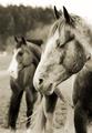
Double Visionby TerryGeeComment: Great Photo...but for this challenge???
{update} After further review and being contacted by the photographer during the challenge, I will reconsider my hasty remark above and say that the challenge is well met.
I initially concentrated on the two heads of the horses. The title being "Double Vision" falsely led me to focus on the faces of these horses. I wondered what was parallel.
Now that I look closer, I "see" the "rhythm" of the photo... Horse Head - Horse Rear - Horse Head - Horse Rear. This rhythmic pattern, though not geometric, is in fact parallel in nature.
The gal from New Jersey has been vindicated and her score from me will now better reflect her artistic vision, rather than my accute mathematical awareness. |
| 03/17/2004 01:44:29 PM |
Pastaby willemComment: Nice Shot! You got the lighting down and everything!
Imitation is the highest form of flattery!
//www.dpchallenge.com/image.php?IMAGE_ID=48054 |
 Photographer found comment helpful. Photographer found comment helpful. |
| 03/17/2004 11:58:46 AM |
The Shadowsby wilksComment: This is a good guitar shot. That glare spot which is front and center is not good. I wish I could say how to contend with that. I need to learn myself and will come back to see other comments. |
| 03/17/2004 11:50:55 AM |
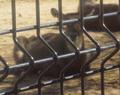
Bueaty Cagedby littlegettComment: Your composition is good.
The overall focus is poor, even though your tried to focus in on the parallel lines.
I would like to see the focus reversed here (on the deer) since you call attention to beauty in your title.
The picture could be bigger overall.
Misspelled title, probably a typo you didn't catch before submittal. |
| Photographer found comment helpful. |
| 03/17/2004 11:46:21 AM |
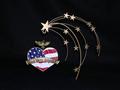
Freedomby candycornComment: I voted this low and here are my reasons:
Bad points:
The strength of the photo is the leading lines of the stars to the heart shaped jewelry. These are not parallel, they are an array.
The subject is rather uninteresting. I can see you may be practicing jewelry photography, in which case the background should be brighter, maybe white, and the subject should be spotlighted IMO.
Good Points:
Patriotism +1
The lighting is even.
Sharpness and clarity are good. |
| Photographer found comment helpful. |
| 03/17/2004 11:31:11 AM |
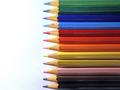
drawing the peaceby carodaniComment: In my opinion, there is too much white space. Filling the frame with the pencil points at the right edge would have been better. |
| Photographer found comment helpful. |
| 03/17/2004 11:02:12 AM |
Life of grimeby johnmComment: This looks like it was taken through a scratched and dirty bus window, which is not good. |
| 03/17/2004 10:50:51 AM |
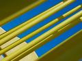
Power Lines and Allby karmatComment: Very bright and cheery with good complementary colors! This should do well...a top 40 hit! |
| 03/17/2004 10:46:15 AM |
|
| Photographer found comment helpful. |
| 03/17/2004 10:19:02 AM |
|
| Photographer found comment helpful. |
Home -
Challenges -
Community -
League -
Photos -
Cameras -
Lenses -
Learn -
Help -
Terms of Use -
Privacy -
Top ^
DPChallenge, and website content and design, Copyright © 2001-2025 Challenging Technologies, LLC.
All digital photo copyrights belong to the photographers and may not be used without permission.
Current Server Time: 08/25/2025 09:34:20 PM EDT.