| Image |
Comment |
| 05/15/2002 01:19:00 PM |
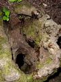
Where Spiders Dareby Ricky CleaveComment: I'm curious to find out what this is. It took me a bit to work out exactly how it is upside down, but I did. The liquid spill is what finally gave it to me. Even without seeing the shadows cast by the flash, I can tell you used a flash. This sin't necessarily bad, by any means. I think maybe if you'd softened it a bit (piece of paper in front of the flash) you might have got a little more detail on some of the moss and wood (?) -- especially along the bottom right. |
| 05/17/2002 11:39:00 AM |
Wedding Invitationby sjgleahComment: Really nice use of a repeating pattern. I think I might have tried to crop it ever so slightly tighter for two reasons. First there's that tiny bit of non-patterned space in the LL corner. Second, to show ONLY the two chairs in the front instead of the two chairs and the little bit more on either side. Very picky, I admit. I like it as it is and think that might just tighten things up a bit. |
| 05/17/2002 09:29:00 AM |
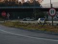
Heaven help you ifyou do 10 in a 60 zone!by sulamkComment: Lucky find. Well, unless you went out and MADE the sign be upside down... This is a little dark and kind of flat -- although I do recognize that it's probably morning/evening. A quick tweak in PS (or whatever editing program) would bring out the levels a little better I think. |
 Photographer found comment helpful. Photographer found comment helpful. |
| 05/19/2002 04:31:00 PM |
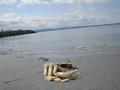
Crab Upsidedown Cakeby tydComment: I think a more extreme angle would have helped kick this up another notch. Also, maybe a little closer to the crab (either in the original shot, or in the crop). Finally, the focus on the crab is a little soft -- a touch of sharpen might help this particular image, but obviously better focus in the first place is even better. :-) |
| 05/17/2002 11:29:00 AM |
Wall Of Fameby ChrommonkyComment: Looks like you used your flash. I think a little more light at the "bottom" of this image would have helped us make out what some of the stickers further away are. Also, I think a good idea may have been to get still closer -- or at least position yourself to fill more of the frame with the stickers and less with just blank wall space. |
| 05/17/2002 09:24:00 AM |
Blaze's Killby kristie380Comment: that little bit of white in the near eye makes him(?) seem crazy -- well, that and the skull hanging out of his mouth... Composition works well for me. The levels -- especially of the main subject and skull -- seem a little flat and washed out. Maybe bump up the highlights a bit, and the midtones down? Personal pref. |
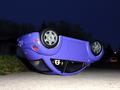
| 05/16/2002 03:08:00 PM |
Roll Overby SonifoComment: When I first saw this, I thought, "Wow, someone got lucky and found a flipped car after all!" Nice little optical illusion. I think I would have tried to further that illusion by shooting it away from the grass that your flash managed to catch. The trees and other things, if far enough in the background wouldn't be an issue in terms of relative size. I'd also like to see it in daylight specifically to play off those trees and that car in the background and some other things. Maybe not possible, but I think it would be fun to try. Good work. :-) |
| Photographer found comment helpful. |
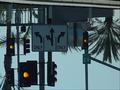
| 05/17/2002 01:52:00 PM |
Which way did you say?by mtngoatComment: Really like the multiple traffic lights in the shot. Like the other upside down roadsign, this seems really dark -- even if taken in the morning or evening, I think it needs to be a little brighter. It may just be an optical illusion but the whole thing looks like it needs to be rotated the tiniest bit clockwise. (Pure speculation -- wonder what it would look like with either green or red lights instead of yellow...) |
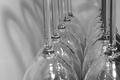
| 05/19/2002 03:58:00 PM |
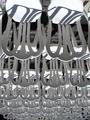
Water Glassesby KimblyComment: I don't quite no what to say about this one. I like the look of the glasses -- given the title, I don't know if there's actually water sprayed up in them, or if the weird reflections are cellophane, or if that's just the way the glasses look. The only thing I really have to suggest might be trying a vertical composition instead of horizontal. |
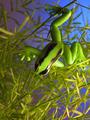
| 05/15/2002 05:05:00 PM |
Treed Frogby PauloComment: The plant reminds me of something we used to have at home that I think was an asparagus fern. But that's beside the point. A little bit of glare on the frog's back that I only find distracting because it's right in the middle of the black streak. Loads of different ways that can be softened. The other side of the frog is a little dark. I would have maybe bounced a little light in there -- but that's a personal pref. there's that yellow stick/branch in the LR I find to be a little out of place since the rest of the plant looks so healthy. Nice shot. |
Home -
Challenges -
Community -
League -
Photos -
Cameras -
Lenses -
Learn -
Help -
Terms of Use -
Privacy -
Top ^
DPChallenge, and website content and design, Copyright © 2001-2025 Challenging Technologies, LLC.
All digital photo copyrights belong to the photographers and may not be used without permission.
Current Server Time: 08/18/2025 04:34:12 AM EDT.