|
|
|
Showing 261 - 270 of ~452 |
| Image |
Comment |
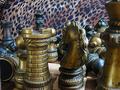
| 05/21/2002 04:30:00 PM | Chess Battleby ozaibakComment: Yay -- the chaos that most of us feel about chess because we only barely even know the rules. Only two comments. First, I would have turned the knight slightly counter-clockwise so we can see it's face a little better and to get it lit more than just on the mane. Second, I'm not sure the leopard print background is the best choice for the picture. I don't have a better suggestion, but it just seems out of place. |
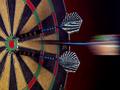
| 05/23/2002 03:07:00 PM | On Targetby jmsetzlerComment: Those darts need a little light from this side to bring out the golden glow of the grips and to differentiate the rest of the shaft from the black portions of the board a little better. (Right now, in some places you can't tell where the board -- or bakground -- ends and the dart begins, apart from visualy continuity. That's not exactly the right word, but if you're not sure what I'm getting at, ask) The board itself is well lit -- the reds and greens really pop, and the wire is perfect. |
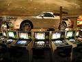
| 05/21/2002 03:22:00 PM | Win a carby bobgaitherComment: I like how this looks like a fish eye shot, because of the way the slot machines curve around, even though it isn't. I'm surprised they let you take a pic in the casino -- but I also seem to remember a forum thread about something like that -- so maybe they made you stop. The midtones here seem a little dark. I can just barely make out some of the features that I would think should be a little more visible (like the chairs at the machines). |
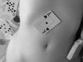
| 05/21/2002 02:54:00 PM | Strip Pokerby KimblyComment: Ah -- going for the sex vote, huh? Just kidding -- nice shot. The camera angle looks a little funny. Did you shoot this one direction and then rotate it 180? All of the cards, chips, and shirt seem appropriately scattered except that AC placed almost perfectly in the center of the body. For some reason it bothers me -- I think it's the placement that does so. Nevertheless nicely toned and lit B&W. Good work. |
| 05/21/2002 10:35:00 AM | you sunk my battleshipby eyegoComment: Wow, very red. Was this to give the feel of an explosion? Since this boat has been destroyed, and the one in the background at least hit, I think I would have added at least a couple of misses to the shot to add some realism. I also have to admit, I don't think the red works. This is a clever idea for a macro, and I think that alone could have carried it off -- especially if you moved one or two of the ships so all you saw around them was "water" and some misses. Finally, the focus seems a little soft -- either better focus taking the shot (preferable) or at least some sharpening during post-processing. |
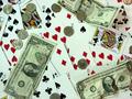
| 05/21/2002 02:26:00 PM | Pokerby sweetk1685Comment: I see the cards and money, but I have to admit I wouldn't immediately think Poker without the title -- gambling maybe. There are an awful lot of compression artifacts -- and I notice your file size is about half what it could be. You might want to save at a higher resolution. The focus on this could also be a little sharper, and the color seems to have something of a green tint -- as if you shot under florescent lighting. Try a levels fix in your image editing program. |
| 05/21/2002 09:39:00 AM | Hat Trick by timj351Comment: I'm a bit torn on the lighting on this one. I like the way it brings out the foil on the darts, but the bakground seems as if it's stuck between two worlds. As if it's not sure if it wants to be well lit, or darkened out. The same applies to the back portion of the dartboard -- darker or lighter. Great sense of action to the shot. I was thinking about how I'd do this -- dartboard facing up and the dart was dropped from above? Makes it a lot easier to guarantee where that third dart is gonna go... |
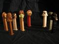
| 05/21/2002 10:18:00 AM | The Pez Wars (now for PS2)by heartsdivideComment: The lighting on this one needs some work -- I can see all the rebel faces, but the empire faces are so dark I only know it's Vader because who else would be a big black blob. I also think I would have worked on the composition a bit more -- some of the rebel pez dispencers in the back are being covered up by ones in the front. Same applies, a little, to Boba Fett and Vader. Overall, though, I just don't see this as much of a game. |
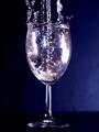
| 05/16/2002 02:52:00 PM | Fill 'er Up-Side Down!by joebarComment: What's upside down about this? You're just pouring water and it's splashing out, right? (Just kidding... I DO see it.) This is one that I think has a little bit too shallow a depth of field. The shutter speed looks like it was fast enough to freeze the water, but a lot of the water is unfocused. The lighting is also a little unbalanced -- I can see the background on the right, not on the left, and I can see a sharp delineation between base and background. I think I'd like to see a little more of that blue on the left -- maybe another light source to help bring that out of the shadow? |
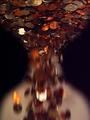
| 05/17/2002 09:41:00 AM | Time of Changeby timj351Comment: While I have a couple of ideas about it, I'll be interested to see how you did this (assuming you don't really have an hour glass filled with coins). It seems kind of dark -- either add a little bit of light to the shot, or make some adjustments in your image editing program. Cool interpretation of the challenge. |
|
Showing 261 - 270 of ~452 |
Home -
Challenges -
Community -
League -
Photos -
Cameras -
Lenses -
Learn -
Help -
Terms of Use -
Privacy -
Top ^
DPChallenge, and website content and design, Copyright © 2001-2025 Challenging Technologies, LLC.
All digital photo copyrights belong to the photographers and may not be used without permission.
Current Server Time: 08/18/2025 08:07:47 AM EDT.
|