| Image |
Comment |
| 05/23/2002 03:31:00 PM |
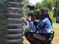
Paintballby David EyComment: OK, one of the kind of comments I hate: I wish that person in the background were on the other team and sneaking up on this one. :-) While it is a cooly shaped piece of whatever, I'm not sure why you chose to give over about a third of your image to the canister being hidden behind. It also looks like the image might be slightly rotated clockwise. I'd either go for a more extreme angle, or level it out. |
 Photographer found comment helpful. Photographer found comment helpful. |
| 05/21/2002 02:42:00 PM |
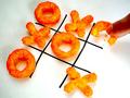
Mmmm... I win!by fsieradzkiComment: I love the color of the Cheetos (I think they're Cheetos anyway), however, the picture looks like maybe you saturated it a bit too much because the fingers are a little too orange. I guess some of that might be from the Cheeto powder though, so who knows. I like the lighting in the lower right end, but it seems to lose some of that brightness as it travels to the upper left. I don't know if that's easily fixable, or even necessary. Just something that might be making a difference. |
| 05/21/2002 03:34:00 PM |
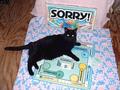
More Of a Game To the Cat Than Usby AquaGoddess12880Comment: Kind of funny how the pieces on the game box echo the cat's ears. You look like you went to the effort to cover over the wood I can see at either side of the picture, but then you cropped it to leave that in. That seems to have defeated the purpose. Everything but the cat seems a little over-exposed -- that may just be because there's a large expanse of black cat in the middle of the pic though. |
| 05/21/2002 03:16:00 PM |
Keep your eye on the Birdie!by rcrawfordComment: Wow -- polarizing filter, or saturation levels? Great blue. I find myself wanting that racket to be more perfectly horizontal. If possible, I think I would have rotated the image a few degrees counter-clockwise too level it out. This is a fun shot. |
| 05/21/2002 03:37:00 PM |
Solitareby PaulinaRDComment: The angle helps give this a little bit of life. I think I would have stopped way down on the aperture to get maximum depth of field -- if possible, maybe you were already there. The cards in the background are just out of focus and this would help make them sharper. Or, open way up and choose where you want your focus to be and let everything else be more unfocused. Take your pick. :-) |
| 05/21/2002 02:38:00 PM |
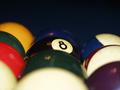
Eight ball corner pocket..by justineComment: I love the perfect DOF in this photo. This takes the somewhat clichè "bunch of eggs" shots and gives it a new twist. That dead space at the top of the image bothers me. I don't think you could have got the same DOF with a more directly overhead shot, but what if you created the illusion of a set of pool balls that had been racked when they were actually spread out over the table a little bit? This may not make sense. If you're curious about what I mean, email me when the voting is over. |
| 05/21/2002 09:35:00 AM |
Days Gone By by tlalondeComment: I dig the lighting and texture and tone and mood and everything. I'm trying to figure out if I like the photo or not. It seems out of place (why would a photo be in a mitt with a ball?), and it also seems too "new" (in relation to the status of the ball and glove). However, I do like the image it portrays. Maybe a compromise -- age the picture a little, make it look older than it is. Totally just a suggestion. Good work. |
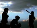
| 05/21/2002 09:59:00 AM |
Waiting on the three two by hokieComment: I think I would have opted for cropping this one to the 640x427 size. There seems to be just a little too much space over the tops of the subjects. Love the way their roles all come through clearly (at least if you know baseball) even though they're in silhouette. |
| 05/21/2002 03:42:00 PM |
Boggleby DigiteyesComment: This seems a little sterile. I think a different base color would have been useful to differentiate from the paper. Also, I appreciate why you might want to use a freshly sharpened pencil, but if all those words have already been written, wouldn't it be not quite so sharp? In fact, it may be the words themselves that make me think of this as sterile. If I'm playing a timed game like this, my own writing is nowhere near that neat and tidy. This all makes it sound worse than I really think it is. Good work. |
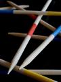
| 05/21/2002 03:00:00 PM |
Mikadoby RemieComment: Nice abstract. For a minute, I thought maybe you'd PSed the stick at the bottom in the lower left corner -- then I realized it was just the blue stripe in the middle of the stick. While I really like the lighting, I think it's a little too strong on the two main sticks in the picture. The grain of the wood in the highlights seems to be there, but not really enough to see. That's a relatively minor thing though. Good work. |
Home -
Challenges -
Community -
League -
Photos -
Cameras -
Lenses -
Learn -
Help -
Terms of Use -
Privacy -
Top ^
DPChallenge, and website content and design, Copyright © 2001-2025 Challenging Technologies, LLC.
All digital photo copyrights belong to the photographers and may not be used without permission.
Current Server Time: 08/18/2025 07:40:24 AM EDT.