| Image |
Comment |
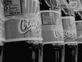
| 06/05/2002 06:45:00 PM |
Have a Drinkby karmatComment: This is one I think I would have ignored the true highlights on and would have let them burn out a little further and go for the whites on the coke bottles as my base highlight. The angle on the bottles is a nice touch, adds a little interest to the shot. |
 Photographer found comment helpful. Photographer found comment helpful. |
| 06/09/2002 03:57:00 PM |
Ponderingby darylbrownComment: I like the pose, and even though things seem a little soft, I like that too. However, I'm pretty sure that monitor calibration differences or not, the skin tones in this picture need to be brighter. As for composition, I either would suggest moving her a little bit further to the right, or maybe turning this into a vertical shot. |
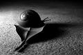
| 06/04/2002 03:07:00 PM |
Snail on dead leafby chariotComment: One of my personal favorites this week. My one I wish would be that the snail's head was a little bit better lit, but that would admittedly be hard to do if you wanted to keep the shell well defined. |
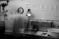
| 06/09/2002 12:21:00 AM |
Rootsby Ricky CleaveComment: I'm starting to wonder if all darkrooms looks the same -- right down to the processing reminders on the wall. LOL This is an interesting pic -- I like the idea of the time blur, but I wish the clock didn't look like the person's head. In fact, it would have been cool if we could have seen some motion blur on one or both of the clock/timers as well. Also, since this is a darkroom, I want it to be darker. I know it's a bizarre thing to say, but there you go. |
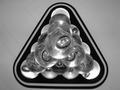
| 06/09/2002 01:27:00 AM |
Lucid Pyramidby jaxxComment: Interesting shot. Did you try any othe compositions -- like maybe instead of placing the bottom of the "triangle" at the bottom of a horizontal frame, you could put it flush against one side or the other? Or maybe put it flush against one side and make it a vertical? Just suggestions. |
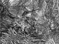
| 06/09/2002 12:36:00 AM |
Nesting Hummingbirdby SwashbucklerComment: I can't think of the way I want to word this. The hummingbird and nest are very clearly visible in the picture, and yet they seem to get lost among all those pine needles. While I've tried very hard not to make comments like this, I wonder if the color of the hummingbird and nest would be enough of a difference from the needles to help set them apart. |
| Photographer found comment helpful. |
| 06/05/2002 06:44:00 PM |
Looking in the Shed at Nightby HoltwComment: I think I would have ignored the "true" highlights (the flecks of white on the window), and used something like that large table on the left as my highlight base to work a little of the flatness out of the photo. Most of this seems fairly grey and I think some differentiation would help. |
| 06/09/2002 04:18:00 PM |
Shadow Playby GeneralEComment: The idea is clever, but I have to wonder why you chose to rotate it the 180 degrees? For me, it adds an uncomfortableness to the picture that seems counter to the subject matter. Beyond that, I just wish I could see more of the shadow puppets the children are making (or trying to make). About the only one that is really a strong part of the picture is the one on the far right. The rest of the children just look like they're sticking their hands out above the table because their shadows are so minimal. |
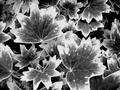
| 06/05/2002 06:52:00 PM |
These are Geranium Leaves?by roshelly35Comment: Nice tonal range. A few compression/sharpening problems, but I didn't notice them until I'd been looking at the picture for a while. The single biggest thing I would prefer to see in this picture is a single focal point. Maybe one big leaf surrounded by lots of small ones? Or a flower surrounded by all the leaves? I don't quite know what to suggest. |
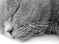
| 06/04/2002 05:00:00 PM |
Zzzzzzzz...by jochenComment: Great texture. Such a fuzzy cat that the fur practically blends together to totally hide where the eye should be. Nice composition. Maybe a little more depth of field so that the fur on his neck is as sharply focused as the rest of his face -- very subjective though. |
Home -
Challenges -
Community -
League -
Photos -
Cameras -
Lenses -
Learn -
Help -
Terms of Use -
Privacy -
Top ^
DPChallenge, and website content and design, Copyright © 2001-2025 Challenging Technologies, LLC.
All digital photo copyrights belong to the photographers and may not be used without permission.
Current Server Time: 08/18/2025 05:16:58 PM EDT.