|
|
| Image |
Comment |
| 12/12/2003 07:52:56 PM | |  Photographer found comment helpful. Photographer found comment helpful. |
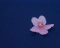
| 12/12/2003 07:42:57 PM | Lonely Violetby ladpupmoeComment: OK -- possibly a monitor problem. This feels a little bit too subdued in terms of its light and dark values -- or perhaps, it's not soft enough. One way or another, for me it lacks a little oomph -- which is a shame because I really like the composition otherwise. I want that flower to pop off the background -- I think it needs to be lighter than it is. If you're worried about it being too bright, you might try a soft focus technique in conjunction with some brighter values. All just my two cents -- take them for what they're worth. | | Photographer found comment helpful. |
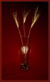
| 12/12/2003 07:38:17 PM | Simplicity In Red & Goldby Spanish_GreaseComment: At first, I wasn't certain if I liked the skewed glass "table". However, the more I looked at the image, the more I decided it was a really nice touch that helped break up the symmetry of the piece and give a little more visual stimulation. Nicely lit and conceived. | | Photographer found comment helpful. |
| 12/12/2003 07:33:53 PM | Simple as...by justineComment: I like the idea here a lot, but I do wish the numbers could either all be the same tone, or be three different tones. The 1 stands out too much for my taste. I keep wanting to see the numerals as ice cubes -- which means, to my mind, you've done a good job toning to change one set of objects into another set in the viewer's eye. Good luck. | | Photographer found comment helpful. |
| 12/12/2003 07:31:45 PM | Punishing Cornerby JohnnyKimComment: Hmmm, interesting abstract. Don't understand it in relation to the title -- not that that is entirely necessary. Personally, I'm struck by the rounder, smoother shapes in the upper right in contrast to the lines and structure in the lower left. If I had a wish, I'd wish for more strong red in the image -- more of an even rainbow feel across the image. I suspect this won't do very well, which is a shame, I think it's a nice abstract. |
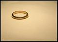
| 12/12/2003 07:29:36 PM | The Essence of Evilby anirenoComment: LOL -- I can think of a couple of ways to tie the image with the quote. Marriage band? Or the One Ring? Yeah, I'm one of the geeks looking forward to the next LOTR installment. Beyond that, nice composition and coloring. The ring feels a little off pure horiszontal and that bothers my eye a bit. (It looks like the ring slants up and to the right just a slight amount -- like the camera wasn't parallel to the surface the ring was on.) It may be an optical illusion -- if it is, no worries, if not, you might want to think about a small amount of rotation (clockwise) to the image. The highlights work well, for me, but the uneven darker areas at the extreme top and bottom edges would be better evened out. All my opinions of course. Good luck. |
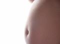
| 12/12/2003 07:25:59 PM | Joaqin Sol Broughton-Quinteroby dc broughtonComment: I really like the idea you started with, but I have one small aspect that I think complicates this image unnecessarily. The portion of breast (arm, possibly?) at the upper center portion of the picture takes, for me, enough of the focus away from the belly as to be noticeably distracting. I like the way the light kind of bleeds the belly into the background -- blurring the line between the two -- by creating such a strong highlight on the skin. There's some strong possible metaphors there, at least in my world view. I also think this would like a lot nicer larger than it currently is -- and I suspect you have a number of people telling you this as well. Good luck. |
| 12/12/2003 07:22:21 PM | Finding Death in Greedby AshezzComment: I'm yet another who doesn't understand the shot -- it looks like a pair of maple seeds to me. Beyond that, let me analyze the shot on its own merits. If you were aiming for abstract (and it could make an interesting abstract, I think), then there's no reason to keep it so small. If you were trying to keep the out of focus aspect minimized by keeping it small, then even at this size the focus problems are readily apparent. There's simply nothing to tie the viewer to the image, my eyes keep shifting between the three "figures" in the shot -- the dark central figure and the two light spots. All my opinion, but I think you can probably do a more intriguing version of this -- whatever it may be. |
| 12/12/2003 07:15:10 PM | Pillby CraigDComment: I totally love the idea here. I was really excited to see it when the thumbnail came up, but I have to admit, this is just too soft for me. If this were in focus (or even just more in focus) I would be a lot more jazzed about it. | | Photographer found comment helpful. |
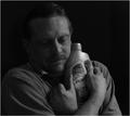
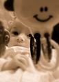
| 09/29/2003 08:32:19 PM | Ariel #6 (duotone)by GeneralEComment: Hey Paul -- didn't see anybody else commenting on this so I thought I would.
Here's what happened as I brought this image up. I started looking at the baby's face and then my eyes literally snapped up and over to the smiley face on the crib toy and had a hard time leaving it. Even looking at it now, I find my eyes tracking up there over and over.
I think the image is really strong as you have it and would only suggest a couple of things to play with in Photoshop -- or whatever program you're using.
First, try an image where you clone (or use the heal tool) to remove the smiley face on the toy. It might not help, but I think it would be worth giving it a shot if you can manage it cleanly.
Second, it looks like you selected a circle/oval around the baby's face, feathered the edges, and then blurred the area outside the circle/oval. Right now, the fact that the blur cuts through part of the baby's hand is what is prompting the following, if you have the capability. Draw a loose selection around those things that are both nearest and furthest from the camera (both of the toys, foreground blanket, and pillow -- being careful with your selection where the toy and baby's face overlap), then blur this area after feathering your edges. Now draw a selection around everything BUT the baby's face, feather the edges and blur everything again. (Near and far things get blurred twice.) You will have to be really careful in the areas around the baby's face, but I think it will add that extra bit of realism to the shot.
Just some ideas to play with if you get the chance. Like I said, this is strong (in my book) and think maybe you could make it still stronger if you'd like to play with it some more. But as always, that's my two cents so take them for what they're worth in this economy.
If I wasn't clear, or you'd like to ask questions, or get some more feedback, or whatever, let me know.
Jeff | | Photographer found comment helpful. |
Home -
Challenges -
Community -
League -
Photos -
Cameras -
Lenses -
Learn -
Help -
Terms of Use -
Privacy -
Top ^
DPChallenge, and website content and design, Copyright © 2001-2026 Challenging Technologies, LLC.
All digital photo copyrights belong to the photographers and may not be used without permission.
Current Server Time: 07/26/2026 01:44:44 PM EDT.
|