| Image |
Comment |
| 08/04/2004 11:38:36 AM |
Soup & Crackers for Lunchby emh11Comment: Very nice! I really like the spoon, the red colours, the pot, I would have skipped the cracker? behind the soup can, to me the white organic shape takes away for the curves and straight lines of the rest of the objects. The reflections on the bottom of the spoon are a bit distacting as well. Still I expect this to be in the top ten for the challenge. - 8 |
 Photographer found comment helpful. Photographer found comment helpful. |
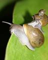
| 08/04/2004 11:36:19 AM |
Snail Paradeby intarsoComment: I really like that you found three, It is still tough to tell scale in this shot since leaves come in all sizes. Also unfortunetly the one part that seems out of focus in this shot is also on the one third line and where the leading lines of the leaf lead too giving it undo attention. My final wish is that the littlest snail the "minature" one had more of it's head out to match the others. |
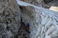
| 08/04/2004 11:33:53 AM |
Snow dwarf <:)by up80Comment: I like the picture, but if the person is what I am to use for perspective the snow looks huge not minature. At least larger then most people will have seen shoveling their driveways.
I like the colors being the person, it draws your eye to them. The placement of one foot back is a bit distrubing as it looks like they only have half a leg. A title to show that person not the snow is the minature would have helped this photo, As would a powerful flash to bring some more contrast into the shadowed area. Hope the comments help sorry I can't rate this photo that high. |
| 08/04/2004 11:16:22 AM |
Notepad Leaves by arpitaComment: One entry, one Ribbon with a beautifully designed idea, that is original and creative too. Wow! And not a single one or two, normally even the best have some trolls given them ones and twos to boost their own shots. |
| Photographer found comment helpful. |
| 08/02/2004 11:40:27 PM |
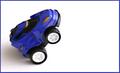
The Blue Streakby BigSmilesComment: What I like, a) It is definitely blue, b) DOF looks great, c) White balance is right on. d) I like the border, but borders are always risking.
Dislike, a) would have cloned out that hotspot above the top tire. b) the choice of car looks too fat to be a blue streak. Would have been more effective as a blue toy race-car. c) I would have liked to see it a black dotted line as if there were lanes. That or another different colored car (same type) beside it looking like they were going to race. Something to give it more of a sense of story, or dynamic feel. Just a few ideas. |
| Photographer found comment helpful. |
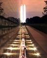
| 07/27/2004 11:37:54 PM |
|
| Photographer found comment helpful. |
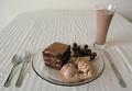
| 07/23/2004 12:39:27 PM |
Dinner time!by turdaveComment: What a great idea, only problem is the folds in the table cloth take away from the image, as to the little spots by the knife. I really like the angle and the DOF, plus the white balance seems right on. |
| Photographer found comment helpful. |
| 07/20/2004 12:03:37 AM |
|
| Photographer found comment helpful. |
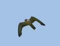
| 07/20/2004 12:02:28 AM |
Freedomby Dim7Comment: Very sharp and clean, excellent for a bird in flight especially one who can move as fast as this fellow. |
| 07/20/2004 12:00:21 AM |
I'm Free !!!by ColeyComment: I love the brilliance and vibrancy of the colours and the expression shown in her arms. |
| Photographer found comment helpful. |
Home -
Challenges -
Community -
League -
Photos -
Cameras -
Lenses -
Learn -
Help -
Terms of Use -
Privacy -
Top ^
DPChallenge, and website content and design, Copyright © 2001-2025 Challenging Technologies, LLC.
All digital photo copyrights belong to the photographers and may not be used without permission.
Current Server Time: 08/26/2025 02:13:14 AM EDT.