| Image |
Comment |
| 01/30/2010 12:51:00 AM |
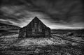
The Wizards House by JohannesFrankComment: Greetings from the Critique Club!
First Impression: I gave this a 7. I like the processing and looks great in black and white.
Composition: Horizon line seems to be in the middle, but it's not as noticeable with the house in the fore front. I might have taken a little bit off the bottom and left sides though.
Subject: Abandoned house in the middle of nowhere is great, title adds to the mystery. Only way it could be better if there was a hooded figure somewhere in the picture.
Technical: Win/Lose situation on the processing it seems, some seem to like the PP others think it's too much. I wouldn't change anything you did though. B/w was a good choice too.
Final thoughts: Like I said I gave this a 7, I thought it would do much better, but DPC is tricky. Looking at your other challenge entries it looks like this type of PP has worked for you before. I think you were just hit by HDR haters.
If you have any questions click here to message me!
Senay Message edited by author 2010-01-30 00:58:30. |
| 01/30/2010 12:06:58 AM |
Purple Frenzyby InsomniacComment: Greetings from the Critique Club!
First Impression: Two lightning bolts in one shot! I especially liked the lightning strike near the church, it looks like it is lighting all of the front. Or maybe it is.
Subject: It's not often that two lightning strikes are captured it a photo, at least not this well done. Best of 2009 and maybe a long time before you get a chance to capture this again.
Technical: At first I felt there was too much space at the very top, after looking at it though I think it's perfect. If you take any away from the top you would lose some of that blue colour.
Final thoughts: I don't really see anyway that you could improve this particular image. I hope to see more from you on DPC. I checked my favourite photographers by votes given, over 9 challenges I've given you an average of 6.67.
If you have any questions click here to message me!
Senay Message edited by author 2010-01-30 00:58:12. |
 Photographer found comment helpful. Photographer found comment helpful. |
| 01/29/2010 09:34:23 PM |
Sunset on the Planet Earthby kyagudinComment: Greetings from the Critique Club!
First Impression: I gave this a 6, I thought of the earth and it's resources as being delicate.
Composition: Horizon's level and placed well, everything seems a little distant though.
Subject: Looking at this picture you could think of it in two ways. People either focused on the point of view that the earth and it's resources are delicate or they focused on the ships and the big industries in the back. Focusing on the first it fits the challenge well, I thought so at least, but just taking a look you see giant cargo ships that are built to carry large amounts, this way it's not so delicate.
Technical: Colours of the sunset are nice and the way the smoke is flowing towards the sun is also good. Picture has a mix of warm (sky)and cold tones (water and the ships). Good choice of title, for me it pointed me to think in terms of the earth and not industrial.
Final thoughts: You still beat out about 25% of the entries so it didn't place too bad, just the lack of something obviously delicate hurt you.
If you have any questions click here to message me!
Senay |
| 01/29/2010 09:12:30 PM |
Bubble Dreams by WeJayComment: Greetings from the Critique Club!
This is my first critique, hopefully you find it helpful!
First Impression: Very interesting image with many things happening. I didn't notice the balloons on the box and was left wondering what exactly the bubbles were.
Composition: I like the way the pole seems to split the image into two separate yet joined scenes.
Subject: Good street photo with different things happening everywhere you look.
Technical: As another commenter said there are not enough bubbles in this picture. If the bubbles at the top had not been cut off you would have received a higher score.
Final thoughts: I was surprised to see you only scored a 5.02. I personally gave this shot a 7. I think this is due to the bubbles not being as much the main subject as other entries in this challenge.
If you have any questions click here to message me!
Senay Message edited by author 2010-01-29 21:14:17. |
| Photographer found comment helpful. |
| 01/29/2010 08:54:43 PM |
|
| 01/27/2010 01:35:51 AM |
ARIADNEby Pipe_DreamComment: One of my favourites out of the challenge. I'm not sure if I would like this more with or without the gold on her. |
| Photographer found comment helpful. |
| 01/27/2010 01:35:41 AM |
Gazingby ryandComment: This is beautiful! The hair, the focus on the eyes, everything is perfect. Hopefully you post a colour version afterwards just to show us how it looks. |
| Photographer found comment helpful. |
| 01/27/2010 01:35:34 AM |
|
| Photographer found comment helpful. |
| 01/27/2010 01:23:42 AM |
|
| Photographer found comment helpful. |
| 01/27/2010 01:21:25 AM |
Fleeingby RamblinRComment: Not a big fan of that tilted border but the picture is stunning |
| Photographer found comment helpful. |
Home -
Challenges -
Community -
League -
Photos -
Cameras -
Lenses -
Learn -
Help -
Terms of Use -
Privacy -
Top ^
DPChallenge, and website content and design, Copyright © 2001-2025 Challenging Technologies, LLC.
All digital photo copyrights belong to the photographers and may not be used without permission.
Current Server Time: 07/18/2025 06:54:28 PM EDT.