| Image |
Comment |
| 03/25/2010 02:32:13 AM |
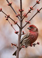
Color Coordinated by vawendyComment: Congratulations Wendy! Two Team Suckers win ribbons in one contest, I wonder if that'll ever happen again! The matching reds are beautiful, this was my highest rated image (I have to admit I only got through about 25% but still). |
 Photographer found comment helpful. Photographer found comment helpful. |
| 03/25/2010 02:28:51 AM |
|
| Photographer found comment helpful. |
| 03/25/2010 02:22:06 AM |
Simplicityby Blind_squirrelComment: Greetings from the Critique Club!
You met the challenge well, although I think the reason you didn't score higher is because while you did meet the challenge it's not that exciting. Others have stated that they liked the simplicity in your image so it's all a matter of personal choice.
I know others may not like the vignette I think it creates a nice border against the white background. The one thing that sticks out the most in your picture is the slight slant at the bottom of the picture, as some other commenters noted.
I see you only have four entries since 2007, does this mean you are entering challenges again? I hope so, your portraits are very nice.
If you have any questions click here to message me!
Senay |
| Photographer found comment helpful. |
| 03/25/2010 01:55:56 AM |
Peek-a-Ducky!by KristinaGComment: Congratulations on your first entry! I thought this was perfect and cute the way it was peeking over the edge. I gave it a 7. Hope to see more entries from you. |
| Photographer found comment helpful. |
| 03/25/2010 01:53:46 AM |
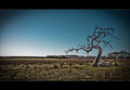
Towards The Lightby Covert_OddityComment: Greetings from the Critique Club!
First Impression: Only got around to voting on about 25% of the entries and didn't get a chance to vote on your image.
Composition: The composition is great and I really love the gradient of light in the background, its just perfect.
Subject: What a great idea to use a champagne flute to hold the branch, it's shape and curves mesh with the curve of the branch so nicely.
Final thoughts: I just don't see any flaws in this, it's a great shot! I don't understand why this didn't score higher. From the top 20 it looks like people really liked trees. You received an average score of 7.33 from your commenters though!
If you have any questions click here to message me!
Senay |
| Photographer found comment helpful. |
| 03/25/2010 01:31:12 AM |
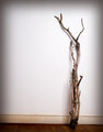
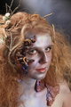
Organic Synthesisby geinafetsComment: [b]Greetings from the Critique Club!
While I think it's a great portrait I think that the lack of a branch as the focal point hurt you. I only voted on about a quarter of the entries so didn't get to yours. I would have given you a 6 though. I viewed your portrait as Mother Nature branching out from the earth.
There isn't much you can do to improve this image, it's pretty solid the way it is. You received comments about making the eyes pop and makeup missing on the right side. Personally I didn't notice the missing makeup and it doesn't make a big difference.
As I mentioned the only reason you scored lower than you expected is because not much branch here. Especially since viewers kept seeing pictures of trees.
Love your work and can't wait to see more challenge entries!
If you have any questions click here to message me!
Senay |
| Photographer found comment helpful. |
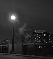
| 03/24/2010 12:23:10 PM |
Here there be monstersby snafflesComment: Greetings from the Critique Club!
It seems I am the designated critiquer for you :)
At first I thought it might Art's picture. I saw the tree as a godzilla for a second! Also reminded me that I forgot my tripod, I'll never let that down haha.
I think that the tree might have been a love it or hate it feature, you know how fickle DPCers can be about blur. I thought the lightpost was great. The only thing I would have done differently is to take this from a little higher angle so that the building in the background is shown more above the railing and fills the sky a bit more.
You received a 6.2 average from the commenters though and  posthumous posthumous liked it so you know you reached some people.
If you have any questions click here to message me!
Senay
Oh and edited to add, I love Yo_Spiff's comments haha Message edited by author 2010-03-24 12:24:55. |
| Photographer found comment helpful. |
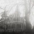
| 03/23/2010 11:07:14 AM |
Victoria's Tearsby posthumousComment: AHH! This is wonderfully blurry! It has a dream/nightmare like feel. Could be out of a movie! Awesome. |
| Photographer found comment helpful. |
| 03/23/2010 11:04:35 AM |
|
| 03/23/2010 11:03:01 AM |
Little Man Ice Creamby DennisheckmanComment: Oh this just gave me an idea for this challenge! DOH! There's an ice cream place that is shaped like an ice cream cone. Bah a little too late. Great find! |
| Photographer found comment helpful. |
Home -
Challenges -
Community -
League -
Photos -
Cameras -
Lenses -
Learn -
Help -
Terms of Use -
Privacy -
Top ^
DPChallenge, and website content and design, Copyright © 2001-2025 Challenging Technologies, LLC.
All digital photo copyrights belong to the photographers and may not be used without permission.
Current Server Time: 07/18/2025 01:57:38 PM EDT.