| Image |
Comment |
| 11/06/2010 01:50:25 PM |
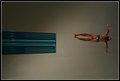
Soar by stantheman1313Comment: Would have worked better in vertical or portrait orientation.
Did you have problems aligning the diver with the board? Symmetry would have given an extra punch |
 Photographer found comment helpful. Photographer found comment helpful. |
| 09/14/2005 12:51:26 AM |
|
| Photographer found comment helpful. |
| 08/09/2005 01:22:02 AM |
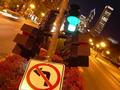
Semaphore resting in the street gardenby ChicagrafoComment: Originally posted by Robinka:
what is it? |
It is a traffic light in a broken pole, to a degree it seems lying on the garden. I found interesting how a traffic light could work in such conditions and look as if nothing. |
| 06/03/2005 04:15:03 PM |
|
| Photographer found comment helpful. |
| 06/03/2005 04:14:27 PM |
The path less traveledby fastaggierunrComment: Good Idea, good composition, but bad technique. There are a lot of elements that distract, the text in the T-Shirt, the orange clip, etc that really weaken the importance of a decision to be taken |
| 05/12/2005 05:57:44 PM |
F r a g i l e by librodoComment: Hello. I am writing in awe of how beautiful your model is. Let me explain it this way: For me she is rather inexpressive in the picture, emotionless, but at the same time I perceive faint fright and disdain, she looks like a fragile ice statue. I really take my hat off for a photographer who can capture so little emotion as brilliantly as to allow it to shine intensely... perhaps that attitude of superiority and vulnerability she portrays is what makes me think your model is so beautiful. Compelled to take a closer look to your picture I saw the aesthetic of Japanese comics, in particular its simplicity, and a question stroke me: How would the composition have been if you used the trick of rotating the picture a bit as they do in Japanese comics?
Anyway, thank you for sharing with us this great photo. |
| Photographer found comment helpful. |
| 01/28/2004 06:42:04 PM |
Straight & Curvedby kosmikkreeperComment: Originally posted by Gordon:
I think I'd like this a lot more without the sign! sort of feels like the sign is just 'in the way' of a great picture, to make it fit the challenge. |
I agree, at the time I voted you with a 9, I knew something was wrong with the picture, but couldn't find out. Now I know, sorry pal, but my opinion is that this is an otherwise magnificent picture that happens to have an unfitting traffic sign which made it fit the challenge |
| 08/27/2003 02:16:54 PM |
|
| 08/22/2003 09:54:27 PM |
|
| Photographer found comment helpful. |
| 08/16/2003 03:02:26 PM |
Final Sunset by rcrawfordComment: Spectacular picture, I feel sad to give it 9 because I see the rightmost part to be superfluous and because IMO the tree centered in the frame would be more powerful |
| Photographer found comment helpful. |
Home -
Challenges -
Community -
League -
Photos -
Cameras -
Lenses -
Learn -
Help -
Terms of Use -
Privacy -
Top ^
DPChallenge, and website content and design, Copyright © 2001-2026 Challenging Technologies, LLC.
All digital photo copyrights belong to the photographers and may not be used without permission.
Current Server Time: 06/27/2026 01:11:16 PM EDT.