| Image |
Comment |
| 08/18/2003 12:22:37 AM |
Just Blue and Yellowby agwrightComment: I like this, but the colors seems a bit flat. More light might help create a greater contrast with the blue sky. |
 Photographer found comment helpful. Photographer found comment helpful. |
| 08/18/2003 12:18:50 AM |
Burning Skyby silverleafComment: Nice composition, though the grain is pretty distracting. I think the negative space usage could be stronger as well. |
| Photographer found comment helpful. |
| 08/18/2003 12:14:16 AM |
Sunflowerby SonifoComment: Awesome use of negative space. I think the lighting and colors are just perfect. |
| Photographer found comment helpful. |
| 08/18/2003 12:13:22 AM |
icarusby SeanachaiComment: I really like this composition. The edges seem a bit soft, though. |
| Photographer found comment helpful. |
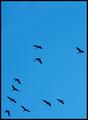
| 08/18/2003 12:11:31 AM |
Broken Formationby buzzrockComment: Very nice. Definitely a great use of negative space. The blue of the sky is a little unappealing on my monitor - not quite sure why. Makes me want to see this in black and white and see if that would make it more dramatic. |
| Photographer found comment helpful. |
| 08/18/2003 12:08:01 AM |
Butterflyby ChiquiComment: The lighting is a bit harsh - lots of reflections on the leaves that I find a bit distracting. I also think the negative space would be more dramatic if the angle placed the butterfly more against the dark background. |
| Photographer found comment helpful. |
| 08/14/2003 12:36:22 AM |
|
| Photographer found comment helpful. |
| 08/14/2003 12:34:29 AM |
|
| 08/13/2003 02:42:53 AM |
|
| Photographer found comment helpful. |
| 08/13/2003 02:42:04 AM |
No more outsby CRobyComment: I like the subject (poker), and the idea that having no more outs is a condition of desolation, but the composition is not great - the background is distracting. The lighting and focus are off, too, and the reflection from the flash on the watch and in the eye doesn't help. |
Home -
Challenges -
Community -
League -
Photos -
Cameras -
Lenses -
Learn -
Help -
Terms of Use -
Privacy -
Top ^
DPChallenge, and website content and design, Copyright © 2001-2025 Challenging Technologies, LLC.
All digital photo copyrights belong to the photographers and may not be used without permission.
Current Server Time: 08/02/2025 05:54:28 AM EDT.