|
|
|
Showing 621 - 630 of ~1474 |
| Image |
Comment |
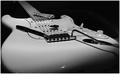
| 02/15/2003 11:22:54 AM | ""My child, pet and best friend"by slamminComment: *Critique Club*
FIRST IMPRESSION: Great shot, well lit. Not sure what the $20 and pen are for. Good choice of subject
CHALLENGE: Meets the challenge.
COMPOSITION: The composition is excellent. I love the "line" of the left side of the guitar against the left edge of the frame.
TECHNICAL: Black and white was a very good choice for this shot. Lighting and exposure are nearly flawless. My only complaint is the hot spot on the front of the guitar.
CONCLUSION: Great shot. It's a shame you hadn't understood the challenge before you shot this, as without the pen and money it would probably have done even better.
Thanks for sharing and good luck in future challenges! |
| 02/15/2003 10:47:06 AM | Some Like 'Em Ripeby 3boyzMomComment: *Critique Club*
FIRST IMPRESSION: Yully-looking pic. I hope you made banana bread with the overripe bananas after you shot this.
CHALLENGE: Meets the challenge.
COMPOSITION: The composition is good, I like the way you nested the bananas. Perhaps you could have improved the composition by putting points of interest (such as the stems of the bananas) at intersections of thirds.
TECHNICAL: The most apparent thing to me here is that the lighting was probably inadequate for this shot. I see you had to use a 1/20 second exposure, and in a controlled environment such as this it may have been appropriate to add more, or more powerful, lighting. This would have had the dual effect of brightening your shot and eliminating some of the shadows. Also, if your camera supports it, adjusting your white balance would have eliminated the orange tinge in the background (which is common in low-light shots, and sometimes indicates slight underexposure).
CONCLUSION: Good idea, decent execution. It might be worth going back to reshoot this as a learning exercise to see if you can improve the technical aspects of this shot.
Thanks for sharing and good luck in future challenges! |
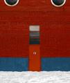
| 02/09/2003 11:35:16 PM | Door #13by zadoreComment: *Critique Club*
FIRST IMPRESSION: Elegant and simple. Proves that a photograph does not have to be complicated to be appealing. Striking color.
CHALLENGE: Unqiestionably meets the challenge.
COMPOSITION: At first glance, this photograph proves that you can break the rules and still have an effective composition, as the door and large window are almost centered left to right. This is not a criticism, though, as it works in this composition (in fact I think anything asymmetrical would fall short, the symmetry is what makes this shot). The rule of thirds is evident in the "13" as well as the placement of the doors and round windows. The inclusion of half of the round windows at the top of the frame is an excellent choice, as it adds visual interest to the top of the frame.
TECHNICAL: Your color is strong and vivid and really grabbed me right away. I think your white point should possibly be a little bit lower though (the snow seems a little dark).
CONCLUSION: Excellent shot, one that I thought was deserving of better than its 30th place finish.
Thanks for sharing and good luck in future challenges! |  Photographer found comment helpful. Photographer found comment helpful. |
| 02/02/2003 03:09:19 AM | a very quite caravan parkby bayuComment: *Critique Club*
FIRST IMPRESSION: Eerie lighting, seems like something out of a horror movie. I'm not sure if that adds to the photo or not.
CHALLENGE: Meets the challenge.
COMPOSITION: The light on the left side is a distraction. If you crop just to the right of that, the image is much stronger. The light pulls the viewer's attention, but once it is removed, everything in the image works together to bring the viewer's eye to the sign.
TECHNICAL: Other than the red cast, the technical aspects of this sht are excellent. I'm not sure what you were trying to do with the red cast, but I think I like it.
CONCLUSION: A strong image that probably could have scored a little better with a very minor change.
Thanks for sharing and good luck in future challenges! |
| 02/01/2003 10:36:13 PM | Waiting for the busby deadbirdComment: *Critique Club*
FIRST IMPRESSION: This shot is a bit bland in my opinion. It's mostly grey and lacks the contrast necessary to draw out your main subject. Also, this image lacks anything to hold the viewer's interest.
CHALLENGE: Meets the challenge.
COMPOSITION: It might have been nice to see evidence of a bus stop along with the sign... people waiting, a bus shelter, etc.
TECHNICAL: There is not enough contrast in this image to draw out your subject. If there is more light at this location at a different time of day (yes I know you're in Iceland, so there might not be), it may have benefitted you to shoot then. Otherwise, a conversion to b/w and pumping up the contrast might have benefitted you. I feel the b/w might help since your background is colurful and competes with the main subject.
CONCLUSION: This is a subject with potential, but overall not one of the most exciting shots this week. Overall, the shots that score best are the ones that seem to have a purpose above and beyond the challenge itself.
Thanks for sharing and good luck in future challenges! |
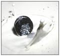
| 02/01/2003 10:10:31 PM | Milk and Cookieby JackoComment: *Critique Club*
FIRST IMPRESSION: Yum! This makes me hungry for milk and cookies just looking at it. It's clear that you've put a lot of effort into getting this just right, and that effort pays off.
CHALLENGE: This image unquestionably meets the challenge.
COMPOSITION: The composition here is very good, I like that you can see the cookie, but I would think the cookie should be down in the milk a slightly more for maximum effect.
TECHNICAL: The light is quite hard here, I wonder if a diffuser might have helped. All other technical aspects are excellent.
CONCLUSION: One of the best shots in this challenge. Nicely done!
Thanks for sharing and good luck in future challenges! |
| 02/01/2003 08:58:17 PM | Look Up Before Passingby GolferDDSComment: *Critique Club*
FIRST IMPRESSION: Great capture. Very impressive and deceptively difficult to pull off.
CHALLENGE: Meets the challenge perfectly.
COMPOSITION: Your composition is just about flawless. You've filled the frame perfectly. The combination of the angle of the plane and the angle of the post on the right side of the plane make it appear that your horizon is not level, but that's actually just an illusion. Still, I wonder if it would make sense to rotate the shot slightly clockwise to counteract that (this is just a suggestion, I did not actually try it).
TECHNICAL: Color balance, levels, esposure, DOF and other technical aspects are flawless. Lighting conditions for this shot were used well.
CONCLUSION: One of the best submissions this week, and there is little I can suggest to improve it. Congratulations on a great photograph!
Thanks for sharing and good luck in future challenges! | | Photographer found comment helpful. |
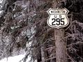
| 02/01/2003 04:37:50 PM | Look what I found in Canada,of all places.by camelotnorthComment: *Critique Club*
FIRST IMPRESSION: Excellent entry, and proof that something simple works. As a bit of a "road-geek" I love the old style US highway sign. This type of sign has not been in production in the US in probably more than 30 years.
CHALLENGE: This shot meets the challenge perfectly. Simple and to the point, yet not boring.
COMPOSITION: Flawless composition, an excellent example of the rule of thirds. The background does not detract at all.
TECHNICAL: Good technical aspect. I have to wonder why you used your macro setting, though, since macro is optimized to focus on subjects extremely close to the lens (within 1m). You may have better luck with a full zoom without using the macro feature, though admittedly I would never have known you had used it if you didn't say so.
CONCLUSION: This is one of the best entries this week. Nicely done!
Thanks for sharing and good luck in future challenges! | | Photographer found comment helpful. |
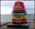
| 02/01/2003 04:28:07 PM | "90 Miles to Cuba-(Southernmost Point)"by slamminComment: *Critique Club*
FIRST IMPRESSION: Very colorful shot. The fence is a little distracting though.
CHALLENGE: Some might argue that this isn't really a "road" sign, though I personally would give the benefit of the doubt.
COMPOSITION: Pretty good overall, but you might have benefitted from moving the sign to the right in the frame a little bit more.
TECHNICAL: Color and exposure are good. A narrower aperture may have helped here. It seems the fence is sharp but the focus on your actual subject is a bit soft.
CONCLUSION: A strong entry, but I think there was a bit more potential here. Overall, nicely done.
Thanks for sharing and good luck in future challenges! |
| 02/01/2003 04:06:14 PM | Crossroad Trafficby juhaseilaComment: *Critique Club*
FIRST IMPRESSION: Wow. This must have either taken quite a bit of patience of been extremely lucky, and I would assume the first. I love the combination of a road sign and jet in the same shot. Funny, and just a little surreal.
CHALLENGE: Meets the challenge perfectly and adds a little twist to boot.
COMPOSITION: I love the way you composed this shot. At first it struck me as odd that the yield sign is cut off, though. Upon thinking about it, I think I like the fact that it is cut off, though perhaps it would have been stronger with the entire yellow part of the sign included.
TECHNICAL: Clarity, DOF, sharpness and color are all flawless. Very impressive.
CONCLUSION: In my opinion this was one of the top entries this week. Nicely done!
Thanks for sharing and good luck in future challenges! | | Photographer found comment helpful. |
|
Showing 621 - 630 of ~1474 |
Home -
Challenges -
Community -
League -
Photos -
Cameras -
Lenses -
Learn -
Help -
Terms of Use -
Privacy -
Top ^
DPChallenge, and website content and design, Copyright © 2001-2025 Challenging Technologies, LLC.
All digital photo copyrights belong to the photographers and may not be used without permission.
Current Server Time: 09/03/2025 04:38:05 AM EDT.
|