| Image |
Comment |
| 01/06/2014 05:13:44 PM |
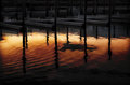
2014 Photo a week. #1: Dusk at Allen Harborby PenelopeKComment: Originally posted by Ann:
The top half is a fairly ordinary photo, but then the painterly bottom half transforms it into something completely different, almost alien. What happens if you take more off the top? Does the balance get better or worse? (I'm asking, I don't have an answer.) |
Glad you asked. I hope we'll encourage and welcome these sorts of discussions in this thread. I like the context provided by the top part. I also rather like the contrast of the plainness, or let's call it simplicity, of the top part against the vibrance of the lower part. You still get that with a bit more taken off the top, but it does quickly start to feel unbalanced to me. If I was to go in that direction I would crop it so that just the fingers of the docks plus a tad of the walkway connecting them showed, which I did consider by the way, but then it seemed to become "just" pretty patterns in the water. |
| 01/06/2014 11:51:31 AM |
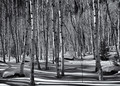
Shadows Play amongst The Aspen by hahn23Comment: Congratulations on a lovely image and a great finish. The strong shadows, besides being lovely in their own right, also serve to keep one's attention on the foreground and the four or five trees there, and that helps the other trees serve as a nice backdrop instead of "competing" for one's attention. |
 Photographer found comment helpful. Photographer found comment helpful. |
| 01/05/2014 10:03:36 PM |
An Evening Walkby ElaineComment: As others have said, nice placement of the group. The side lighting adds a lot by revealing the folds/creases in their clothing, which enables me to better "feel" their movement. |
| Photographer found comment helpful. |
| 01/05/2014 12:32:38 AM |
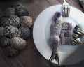
lunch-for-one_8032by mariucaComment: I love the arrangement on the plate, especially including segmented fish portions alongside the uncut filet. |
| Photographer found comment helpful. |
| 01/04/2014 11:14:36 PM |
|
| 01/04/2014 11:13:08 PM |
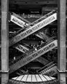
Week 1 - Pacific Placeby AnnComment: Quite a different scale than I expected from looking at the thumbnail. Black and White is great good choice. It nicely emphasizes the textures of the different materials used, ie metal, stone, etc. without much visual distraction by the stores and people. But I bet that in fact it's a great people watching place too! |
| Photographer found comment helpful. |
| 12/30/2013 10:46:08 AM |
|
| Photographer found comment helpful. |
| 12/30/2013 08:15:54 AM |
|
| Photographer found comment helpful. |
| 12/28/2013 02:17:18 PM |
|
| 12/28/2013 12:30:59 PM |
|
| Photographer found comment helpful. |
Home -
Challenges -
Community -
League -
Photos -
Cameras -
Lenses -
Learn -
Help -
Terms of Use -
Privacy -
Top ^
DPChallenge, and website content and design, Copyright © 2001-2025 Challenging Technologies, LLC.
All digital photo copyrights belong to the photographers and may not be used without permission.
Current Server Time: 08/11/2025 10:55:44 PM EDT.