|
|
| Image |
Comment |
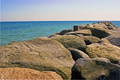
| 05/27/2007 11:28:46 PM | Pier of Stoneby LahnetComment: Greetings from the Critique Club
I love the shapes, forms, and textures of the boulders here. And the very different texture of the sea makes a great contrast. Good point of view; not too high and not too low. And the composition works well, although a touch of life would be nice. (I wish you could have coaxed a seagull to pose on that nearest piling!)
The colors here are great as well. I was wondering if black and white would be better since you then wouldn't expect the sky to be blue. And it might (although a good conversion that separates the rocks and water won't be easy), but the color adds so much here that it wouldn't have the same impact.
Yeah, the lighting is really tough here. Too bad you couldn't have come at a different time when the sun was lower and the light better. It would have made a huge difference here.
Also, there seems to be a lot of noise here that is dulling the sharpness this photo should have. A DLSR at ISO 100 shouldn't have this problem. I'm going to take a guess and say that it's from the slight rotate you did to get the horizon straight. (I can tell you did this from the white strips at the corners. And you didn't quite go far enough, although the slanted horizon isn't really apparent so it isn't a big deal.) Rotation has to interpolate, and with the textures here, the interpolation may have generated the noise. (Another possibility is that you don't have your camera set to save the highest quality possible and the noise is caused by JPEG compression artifacts.)
Overall, a nice photo. Not great, but certainly peaceful and enjoyable to look at. |  Photographer found comment helpful. Photographer found comment helpful. |
| 05/27/2007 08:25:22 PM | Orchid Petalsby dbambrickComment: Greetings from the Critique Club
Beautiful flowers! The black background really makes them stand out, and brings out the great color. I like the arrangement, and the composition works well; the back of the flower and bud near the bottom add a nice touch.
As others have pointed out, the single light isn't very effective here. It doesn't really show off the three-dimensional form of these flowers. It shows a bit in the bottom orchid; you can see how the column and lip come forware and the sepals curve gently backwards. But the top two look flat.
The problem with flower photos in general is that they tend to get boring after awhile. It's easy to make them beautiful; the challenge is to make them unique and interesting. I'm not very good at it myself, but have found that little things can make a big difference. Here, for example, I think that just turning the middle flower slightly to the left would make it stand out more (although I may be wrong!). | | Photographer found comment helpful. |
| 05/27/2007 07:21:29 PM | A Dip in the Rail to Foreverby theSajComment: Greetings from the Critique Club
This photo has a nice feel, kind of light and airy. Black and white was certainly a good choice here, and the brightness and contrast you've set suit the subject, and help set the overall mood. The vertical format suits the subject. Composition works OK, although cropping off half the sky helps put more attention on the tracks. Technically very well done; sure, the highlights are blown, but that's hard to avoid with the given light.
But there's no real excitement here. It's just another looking down the railroad tracks cliché shot. Making it exciting requires more interesting lighting, a different point of view, some way of emphasizing a particular feature like the dip (besides the title), or something similar. |
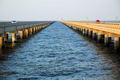
| 05/27/2007 10:49:48 AM | Water Under the Bridgeby cyclist678Comment: Greetings from the Critique Club
This photo nicely conveys the length and majesty of this bridge. The light has a great quality and nice color. The symmetric composition and horizontal format provide stability that is a good match for the subject. Lots of diagonal lines converging on the vanishing point make the photo dynamic. I really love the triangular negative shape of the water, and the choppiness gives the water a really interesting texture.
The major problem with this photo is the overall lack of sharpness. And there are three reasons for this. First is the wide aperture; going down just 1 stop would have helped, even at the risk of more color noise with a higher ISO (you wouldn't want a slower shutter speed here). Second, the whole process of converting a scene to pixels reduces sharpness, and you nearly always need to use some sharpening tool to add it back. (Unsharp Mask is the most common tool for this.) Third and most important, when using JPEG, always use the highest quality you can. Compression artifacts are the main source of fuzziness in this photo. They are most easily visible around the signs and car on the right side (magnify the image to see them more clearly), but they are prevalent in the water as well. If you use JPEG in your camera (instead of RAW), always choose the highest quality. And when you save photos for DPChallenge, choose the highest quality that keeps the size under the 150K limit (this photo is only 90K).
In an ideal world, the sky would have been more interesting here. Not a lot you can do about that, though. A polarizer might have helped, although it might also have made the water too dark. | | Photographer found comment helpful. |
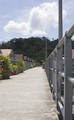
| 05/27/2007 12:35:12 AM | Pathway on the Water Villageby ZulComment: Greetings from the Critique Club
This is certainly an interesting place to make a photo. There is a nice rhythm in the rooftops and the fence, and a great cloud. Lots of nice lines (converging on a Vanishing Point, which is important for this challenge). And the vertical format complements the scene.
But two things make it a bit boring: the harsh mid-day light and the centered composition. Taking photos close to sunrise or sunset gives both more appealing color and interesting shadows. And keep the rule of thirds in mind; put the focal point a third of the way up or down (and/or left or right) for a more interesting composition. No "rule" in photography is hard and fast; there are always times to ignore them. But they are working against you here.
The composition of this photo could be improved by cropping. Unlike iamwoman, I would keep the sky and crop some of the bottom; the sky is interesting, the pathway is not. While I'm at it, I'd also crop off some of the right; the fence is a bit overwhelming there in the foreground, and it throws off the balance.
It would also help a lot to darken the sky to make the cloud more dramatic. This can be done without spot editing by using Shadows/Highlights to darken the highlights or, for finer control, using Curves to increase the highlight contrast. Using a polarizer while shooting probably would have worked even better.
Overall, not a bad photo. But not a very interesting one either. Keep making pictures; getting your vision across in a photo takes lots of practice. | | Photographer found comment helpful. |
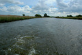
| 05/26/2007 09:21:48 PM | Slipstreamby GrandadComment: Greetings from the Critique Club
The slipstream is indeed fascinating. The swirls and texture make a nice abstract design. The direction and quality of light aren't optimal to really show it off, but it's still very dynamic and exciting.
Unfortunately, despite the title, the slipstream isn't the real subject here; it's only a minor part of this photo. The powerful diagonal lines of the slipstream and banks lead the eye away from the slipstream and to, well I guess the focal point is the dark and fuzzy group of trees in the background. Which is a so-so example of a vanishing point, but really isn't that exciting. The horizontal format and overall peaceful, idyllic feeling of the photo also tends to downplay the excitement of the slipstream.
Two alternative shots would have made a more exciting photo. One is to ignore the slipstream, zoom in a bit, and point the camera up enough to make the sky take the upper 2/3 of the frame. That would emphasize the vanishing point aspect (so be better for the challenge) and make a more serene photo. The clouds are plenty interesting here, and a polarizer would darken the sky and bring them out. The other is to really emphasize the slipstream by turning the camera sideways and getting it as low (close to the water) as you safely can. Keep the vanishing point to provide context (and meet the challenge), but make it secondary to the dramatic slipstream. Including part of the boat or whatever is causing the slipstream might also add interest (it's hard to say without being there).
And some words of advice for future photos: When using JPEG, always use the highest quality available; some of the fuzziness around the trees and elsewhere in this photo looks like JPEG compression artifacts. And avoid oversharpening; I think that's what caused the light "halos" around the dark parts of the horizon. | | Photographer found comment helpful. |
| 05/25/2007 07:24:17 PM | Around The Bendby EssAreDubyaComment: Greetings from the Critique Club
This is a refreshingly different take on the challenge: the Vanishing Point is out of the frame! That may have cost you some points from people who thought it didn't meet the challenge, but I personally like it.
The staircase has a lot of character and makes an interesting subject. The panoramic format suits it well, although the DPChallenge limits keep it from being large enough to really appreciate it. (That may have cost some points too, although it was a good choice for this photo.) It's hard to say without being there, but a lower point of view (a "child's eye" view) might have been more dramatic.
The non-directional light here isn't very interesting, but probably not something you can control (although you might try different times of day or different weather conditions). But you can make up for it a bit in Photoshop by increasing the midtone contrast. Actually, I think the midtone brightness is a bit high too. Both of these can be adjusted using Curves. Try setting a point at about 190,190 to keep the highlights intact, and another point around 65,38 to increase midtone contrast and decrease brightness, and see what you think. (Move both points up and down to meet your tastes.)
One nit: it looks like there is some trash on the 4th step. Although you can't clone it out with basic editing rules, it could have easily been removed before taking the photo. But it's only a mild distraction, not really a big deal.
Overall, a nice photo. I love the different lines and textures, and the whole idea "what's behind the bend" it captures. | | Photographer found comment helpful. |
| 05/24/2007 08:44:24 PM | Sister of the Brideby bjuicephotoComment: Greetings from the Critique Club
This is a great photo. Very emotive with the low key and red color. The model's position and subtle props tell a story, which the title helps explain, but without really detracting from the mystery.
The single-source lighting matches the lonely mood well, and preserves the low key that is so essential here. The glare on the model's shoulder is mildly distracting; a slight reposition might have avoided it, or perhaps some makeup to make her skin less glossy. The brightness makes this the first thing the viewer notices, although the rest of the photo is so powerful that this isn't a big deal. (If spot editing was allowed, it could have easily been cloned out. But that's part of what makes DPChallenge challenging!)
The composition is good. Simple yet sophisticated. I personally like the subtle line in the background (the arm of a sofa, I assume); it helps with the vertical balance, and leads the eye to the subject. The horizontal balance is slightly off; the photo needs just a bit of space to the left. And the rose doesn't really add anything and is hard to see; I think the photo would be better without it.
Technical aspects are perfect. Focus is right on, yet nicely soft to match the overall mood. Color is great. Exposure is just right.
Again, a great photo. I've really enjoyed studying it. |
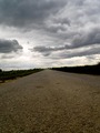
| 05/24/2007 07:44:25 PM | Im on a road to nowhereby RalphcoComment: Greetings from the Critique Club
From the title and your comments, your intent here was to emphasize the road. And this photo does nicely capture its texture, color, shape, and length. But the sky really steals the show here. It's bigger, brighter, more dramatic, more colorful, and just a lot more interesting. The road just can't compete!
To increase the focus on the road, the camera needs to be pointed down so that there is just a bit of sky at the top of the photo. Shooting close to the ground is great, as is the vertical format. Tilt could also be effective here, but it needs to be exaggerated so viewers know it's intentional. The slight tilt here looks like carelessness. A smaller aperture would have increased the depth of field and provided extra sharpness that would have really helped here. And converting to black and white could be considered, although that does change the personality quite a bit.
But the sky here is so wonderful that I think it would have been a better main subject, leaving the road as a secondary element. Taking it from road level would still be great; the road texture would add interest without detracting from the sky. But point up so the road only take about a third of the photo. And I'd want to see a straight horizon and a horizontal format to make the most of the sky. It would certainly a much different photo than what you intended here! | | Photographer found comment helpful. |
| 05/18/2007 12:07:58 AM | My Brown Eyed Girlby meganoComment: This photo caught my eye while I was checking your profile as part of the critique on your other photo. She is so cute! What a great expression. The unique 3-dimensional form of her cheeks is perfectly captured here, and really brings out her character. Nice "fill the frame" composition. I really like it! | | Photographer found comment helpful. |
Home -
Challenges -
Community -
League -
Photos -
Cameras -
Lenses -
Learn -
Help -
Terms of Use -
Privacy -
Top ^
DPChallenge, and website content and design, Copyright © 2001-2025 Challenging Technologies, LLC.
All digital photo copyrights belong to the photographers and may not be used without permission.
Current Server Time: 09/03/2025 03:18:12 PM EDT.
|