Greetings from the Critique Club
This is a refreshingly different take on the challenge: the Vanishing Point is out of the frame! That may have cost you some points from people who thought it didn't meet the challenge, but I personally like it.
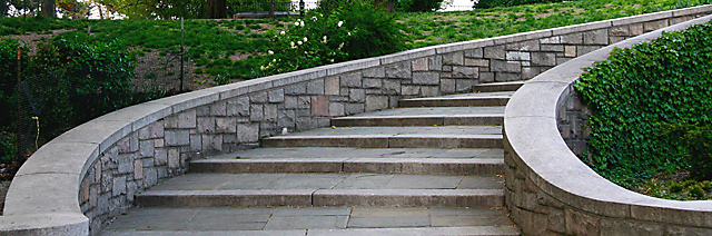
The staircase has a lot of character and makes an interesting subject. The panoramic format suits it well, although the DPChallenge limits keep it from being large enough to really appreciate it. (That may have cost some points too, although it was a good choice for this photo.) It's hard to say without being there, but a lower point of view (a "child's eye" view) might have been more dramatic.
The non-directional light here isn't very interesting, but probably not something you can control (although you might try different times of day or different weather conditions). But you can make up for it a bit in Photoshop by increasing the midtone contrast. Actually, I think the midtone brightness is a bit high too. Both of these can be adjusted using Curves. Try setting a point at about 190,190 to keep the highlights intact, and another point around 65,38 to increase midtone contrast and decrease brightness, and see what you think. (Move both points up and down to meet your tastes.)
One nit: it looks like there is some trash on the 4th step. Although you can't clone it out with basic editing rules, it could have easily been removed before taking the photo. But it's only a mild distraction, not really a big deal.
Overall, a nice photo. I love the different lines and textures, and the whole idea "what's behind the bend" it captures. |