| Image |
Comment |
| 08/20/2004 06:55:26 PM |
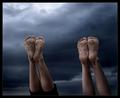
After Hours: Hustle & Bustleby dhareComment: To much going on in this photo fore my taste and it brings the photo down to cut off the feet as you do, just a little bit lower aim and it would have raised the ratings. On the other hand I would have suggested a vertical framing with focusing on the left side of the motive focusing on the Hungry Jack's, then with all of the feets in the frame and also more of the house at the top. |
 Photographer found comment helpful. Photographer found comment helpful. |
| 08/20/2004 06:50:55 PM |
Funnzlesby stupidcatComment: A tighter vertical crop would have made this better, but this is not bad, 70% my guess. |
| Photographer found comment helpful. |
| 08/18/2004 11:00:49 PM |
Reach for the sky by smokeditorComment: Just a little bit to tight framing on the right site, but I like the tones and the idea, maybe a centered version would have been the thing for this!? |
| Photographer found comment helpful. |
| 08/18/2004 10:58:29 PM |
Green waveby amazoneeaComment: Very well seen, but if you would have submitted a cropped version of this photo, without the leaf on the left, then I think you would have been at the top of the challenge with this photo. Great, I like it. |
| Photographer found comment helpful. |
| 08/18/2004 10:51:57 PM |
Fireby KonadorComment: I like the deep contrast and deep juicy colors in this image, also a good placement for the sharp flower, but the out-of-focus flower to the left is a bit distracting, maybe a more blurred background would work better or a cropped version without the flower on the left. But this is a good photo overall. |
| Photographer found comment helpful. |
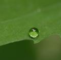
| 08/18/2004 10:46:06 PM |
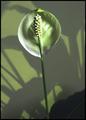
Crystal Ballby RoosterComment: Macro shots can often be very interesting. I like the motive you've got here but the composition IMO could be slightly better with the drop placed further from the central of the image, maybe a little bit more down to the right corner just the drop's size down to the right. And then I think it's better to crop one third off from the top. Then you would have a better composition IMHO and a better photo. The green overall tone is great. |
| Photographer found comment helpful. |
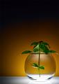
| 08/17/2004 06:02:35 AM |
Botanical IIby davidbedardComment: Good photo, would be better and even have a chance for a ribbon if you crop the leaf at the bottom in the background from the photo, leaving you with a square format photo. I like the colors and lighting condition. |
| Photographer found comment helpful. |
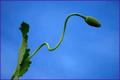
| 08/16/2004 05:59:06 PM |
Helianthus annuus in strong windsby dinnyComment: Good colors, abstract, I like it a lot! Maybe you'll get many low ratings, but that's just the variable tastes of people, sorry. But on the other hand, if there are some people here, liking it as much as me, then I think this could be just above midrange. |
| Photographer found comment helpful. |
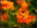
| 08/16/2004 05:55:22 PM |
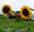
Sunflowersby emorgan49Comment: The background ruins this photo, you should have placed the camera lower, pointing it upwards so the photo would be more simple with "clean" background, better luck next time! |
| Photographer found comment helpful. |
| 08/16/2004 12:38:28 AM |
|
| Photographer found comment helpful. |
Home -
Challenges -
Community -
League -
Photos -
Cameras -
Lenses -
Learn -
Help -
Terms of Use -
Privacy -
Top ^
DPChallenge, and website content and design, Copyright © 2001-2025 Challenging Technologies, LLC.
All digital photo copyrights belong to the photographers and may not be used without permission.
Current Server Time: 06/16/2025 05:51:34 PM EDT.