| Image |
Comment |
| 02/09/2003 09:30:14 AM |
Roast, Grind, Brew and Enjoy!by DougPazComment: This photo effectively shows the process of making coffee, but I think there is too much in it to have a high impact. It's more of a diagram, something that could illustrate a page in a book on coffee making or something. It's well photographed, but not appealing. |
 Photographer found comment helpful. Photographer found comment helpful. |
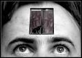
| 02/08/2003 11:23:14 PM |
Open Mindedby lisaeComment: Thanks Mag. I do understand the sharpness problem (as I said in my comment). The white edges... I understand how it looks, but the ones around the cat are really where her fur made her edges fuzzy, and I left them there because without them she looked a bit weird. There are also white edges on the inside of the window frames because they're there in the photo. I smudged the life out of all the other edges in the image with Gimp's little smudgy tool. I like your other suggestions. If I do have time I will definitely try it again!
By the way, I had the idea of putting windows on a face, although I thought of replacing the eyes. Exposing some brain was Annida's suggestion, and I love it :). |
| 02/08/2003 12:54:53 PM |
Coal to Diamondby karmatComment: The diamond is actually quite difficult to see from this angle. Other than that, it's a cool idea and well photographed. |
| 02/08/2003 12:53:19 PM |
Growing Up by jenaromComment: Nice idea, beautifully executed. That baby's skin just glows! The composition is masterful, especially the way the baby's feet are not in line with the adult's. If they were, all the life would be leeched out of the photo. As they are, the subtle difference makes it live. I have to give it 10. |
| Photographer found comment helpful. |
| 02/08/2003 12:50:40 PM |
Friday Nightby DennisFComment: Very busy and confusing. I think you needed to pare down the number of elements you wanted to get into this photo. The impact is just not there when there are so many things to look at, and the composition doesn't really make any one object the subject. |
| Photographer found comment helpful. |
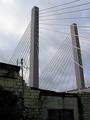
| 02/08/2003 12:48:12 PM |
Rising Tallby timj351Comment: Beautiful. The composition of this is really effective. The buildings down below may seem a little bit dimly lit, but that actually works given the theme of the new structure towering over the ruins of the old one. |
| 02/08/2003 12:44:09 PM |
|
| Photographer found comment helpful. |
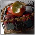
| 02/08/2003 12:39:48 PM |
Before and After the Big Biteby RLSComment: A very rich photo, nicely lit and composed. It doesn't grab me, but I can appreciate its technical merit. I can't fault it in that respect. |
| Photographer found comment helpful. |
| 02/08/2003 12:36:51 PM |
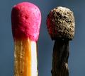
Mis-matchby Fibre OptixComment: The lighting on this is a bit too hard, and the background is a dull colour. It sucks when there are more than one photo of the same thing in a challenge, because we shouldn't score one photo relative to another, but I think "King Flame's Court" shows really well how differently you could have shot this! |
| 02/08/2003 12:33:15 PM |
Bloomin'by hardwaybetsComment: Cool! I love the way you use shallow DOF. The flower that lost its petals is the subject, and the flower in the background is kind of a visual echo of what it used to be. I like how they nearly line up, making the effect more pronounced. I'm giving this 10. |
| Photographer found comment helpful. |
Home -
Challenges -
Community -
League -
Photos -
Cameras -
Lenses -
Learn -
Help -
Terms of Use -
Privacy -
Top ^
DPChallenge, and website content and design, Copyright © 2001-2025 Challenging Technologies, LLC.
All digital photo copyrights belong to the photographers and may not be used without permission.
Current Server Time: 08/27/2025 11:16:12 PM EDT.