| Image |
Comment |
| 03/02/2003 12:04:28 PM |
Our Futureby smellyfish1002Comment: Reminds me of the unborn child at the end of "2001: A Space Odyssey". It's very lovely, and I can see this working well as a stock photo, but the colours are a little washed out. Also, the border seems uneven. |
| 03/02/2003 12:02:48 PM |
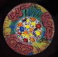
Sweet Flowerby GolferDDSComment: Strange idea. Very colourful, but the composition is too central without a good reason for it. The objects at the centre are underwhelming compared to the plate, in my opinion. I don't think it would work in many applications as a stock photo. |
| 03/02/2003 12:01:35 PM |
|
| 03/02/2003 11:59:56 AM |
Storm Brewingby GraciousComment: Great sky, and lovely composition around the boats and wharf. I think this could work as a stock photo. |
 Photographer found comment helpful. Photographer found comment helpful. |
| 03/02/2003 11:57:52 AM |
Color Mattersby DougPazComment: This seems very similar to a photo that's been submitted here before... but I guess it's a common idea. I can see it working well as a stock photo. |
| 03/02/2003 11:56:43 AM |
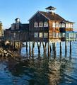
The Dock Houseby GotchaComment: Beautiful colours and textures. I love the composition. It's just a very, very cool photo. I'm not sure if it qualifies well as stock though, because it's such an unusual structure. |
| Photographer found comment helpful. |
| 03/02/2003 11:55:02 AM |
Colorbrellaby AntithesisComment: I'm not sure this would work as a stock photo. The composition is very central and the strong lines lead your eyes right up to the crisscrossed pattern in the centre. This would distract from any other material the photo was used to support. |
| 03/02/2003 11:52:16 AM |
Hands Upby JeanComment: Creative composition. I'm not sure it works as a stock photo. The colours are very washed out. I think it could do with some work on post processing. |
| 03/02/2003 11:47:50 AM |
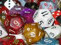
Diceby PopeTomComment: You're such a role playing geek!! :P.
I'm not sure that this would have a lot of uses as a stock photo, unless it was for a magazine specifically on the topic of role playing. The lighting seems too harsh and not diffuse enough, and the assortment of dice is too disordered to create a focal point for the composition. |
| Photographer found comment helpful. |
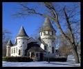
| 03/02/2003 11:45:37 AM |
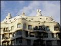
Curwood Castleby GekkerComment: Well photographed, although the photo seems a bit bland to me. I think it could have uses as a stock photo, but a more generic building would be a safer bet. |
Home -
Challenges -
Community -
League -
Photos -
Cameras -
Lenses -
Learn -
Help -
Terms of Use -
Privacy -
Top ^
DPChallenge, and website content and design, Copyright © 2001-2025 Challenging Technologies, LLC.
All digital photo copyrights belong to the photographers and may not be used without permission.
Current Server Time: 08/26/2025 11:09:59 PM EDT.