|
|
|
Showing 1571 - 1580 of ~1634 |
| Image |
Comment |
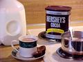
| 05/07/2002 03:07:00 AM | Warm and Chocolateyby ohsmomComment: Mmmm... cocoa.... I think this image is a bit too busy to be an effective advertisement. I don't think it needed the milk bottle to be in the shot, and the stovetop is just a bit extraneous. I think just the cup with those little cakes and the cocoa tin could have been enough, maybe with some other table setting type things? Still, it made me go mmmmmmm :) |
| 05/07/2002 06:00:00 AM | |
| 05/07/2002 04:40:00 AM | |
| 05/07/2002 02:43:00 AM | Canon digital photography - for the beauty in lifeby ssComment: Nice photo, but the connection between the zoom lens and the woman with the flower is a bit tentative. Is she intended to be the subject of a photo? The depth of field is really effective though, as well as the purple reflection in the lens. I like it :) |  Photographer found comment helpful. Photographer found comment helpful. |
| 05/07/2002 06:08:00 AM | Off Roadingby BAMartinComment: Something is weird about that sky, and the grass as well. The jeep is well photographed, but the surroundings aren't very inspiring and it's not very well framed. |
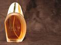
| 05/07/2002 02:51:00 AM | Realmby shortredneckComment: I think the colour of the background is a bit dull to give the impression of richness and luxury you were after, although the variations in the colour and the overall texture is nice. Nevertheless, it's not nice enough to take up that much of the photo. The lighting is effective, but too strong, making the reflections on the lid blow out. The name of the product isn't clear... I can work out what it is, but in an advertising shot it would have to be 100% readable. Otherwise a nice imitation of a perfume ad. |
| 05/07/2002 02:15:00 AM | ABSOLUT drownby censuraComment: Hmm, the subject is kinda grotesque, the backdrop is a dull brownish-grey, the lighting doesn't seem to have any purpose.... sigh. |
| 05/07/2002 03:12:00 AM | salt that stingsby ritaardComment: It's a gorgeous photo, but I don't get what it's selling! Am I missing a drug reference here? :) Oh well, I'm not the type to rate good photos down. |
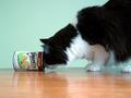
| 05/07/2002 04:25:00 AM | Uh-oh!by tmack74Comment: It's cute and nicely composed. The colours of the bakcground and the floor seem a bit dull to me, and the reflections on the floor are distracting. |
| 05/08/2002 12:07:00 AM | What's better on a warm summer day?by Palli747Comment: I think if you're going to have a cute girl in an advertising photo, her face shouldn't be almost completely in shadow. Also, the pepsi bottle isn't as prominant as the logo on her shirt, which is confusing. The setting is interesting for a photo, but not enticing for an advertising shot. Lastly, can I have a cute boy bring me my pepsi, please? :) Actually, I guess the rationale behind using girls in most advertising is because the males in the audience want her, and the girls in the audience want to be her, so it's win-win.... somehow. |
|
Showing 1571 - 1580 of ~1634 |
Home -
Challenges -
Community -
League -
Photos -
Cameras -
Lenses -
Learn -
Help -
Terms of Use -
Privacy -
Top ^
DPChallenge, and website content and design, Copyright © 2001-2025 Challenging Technologies, LLC.
All digital photo copyrights belong to the photographers and may not be used without permission.
Current Server Time: 08/25/2025 11:23:36 PM EDT.
|