| Image |
Comment |
| 05/07/2002 04:36:00 AM |
|
 Photographer found comment helpful. Photographer found comment helpful. |
| 05/07/2002 04:32:00 AM |
|
| 05/07/2002 12:31:00 PM |
|
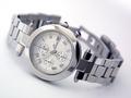
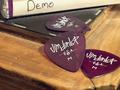
| 05/07/2002 06:06:00 AM |
i made this table...by blueeyedemoboyComment: I'm not quite sure what the product is... the plectrums? Otherwise it's a fairly nicely composed photo, just not very interesting. |
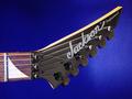
| 05/07/2002 02:57:00 AM |
Jackson Guitarsby jmsetzlerComment: I really like this one. The shapes are great, well framed, and the colour of the backdrop is daringly vivid :) I'm not sure how it sells the guitar, but it's a cool photograph. |
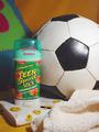
| 05/07/2002 12:40:00 PM |
How About A Game?by MrsKroComment: Does it smell like teen spirit? Hang on, not being American I'd never heard of that deodorant until I saw this picture. Suddenly the title of that song has a new meaning to me.... |
| 05/07/2002 01:53:00 AM |
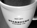
Tazo Chai: The Reincarnation of Teaby TrickyBuddhaComment: The title is the only thing that indicates this is advertising tea. From the picture, I would guess it was an advertisement for Starbucks, but then again, it doesn't seem to be inviting me to buy anything from them. It's just a picture of a cup. It's a very *nice* picture of a cup though :) I love the swirly patterns in the tea. |
| 05/07/2002 02:32:00 AM |
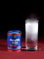
..too much turkeyby vin rigbyComment: Nice lighting, although there's a line of shadow right down the front of the tin. The lid is not on properly. There's also little grains of the stuff on the table. I like the mist coming out of the top of the glass. Conceptually, I don't think this kind of photo suits the product. It gives the impression of something sophisticated and luxurious with such dark, strong colours, when for a medical product you tend to want an overall feel that's lighter and more soothing. |
| 05/07/2002 07:32:00 AM |
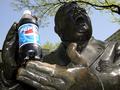
Pepsiby arnitComment: Wow, this one looked great as a thumbnail, a bit retro... but from seeing the full image this kind of shot really needs a professional makeup artist :). Her eyes are very fetching, drawing you down her nose to the bottle, and the horizontal stripes of her top are very effective, but it's the kind of shot that needs a lot of planning and work because little flaws stand out a lot. |
| 05/07/2002 03:52:00 AM |
Yeah Baby... I Love Pepsi!by pdb209Comment: Very well set up, nice composition... the lighting is a bit harsh though, especially since the highlight on the pepsi bottle cuts through the logo. I really like the hands and how the bottle is positioned in them. |
Home -
Challenges -
Community -
League -
Photos -
Cameras -
Lenses -
Learn -
Help -
Terms of Use -
Privacy -
Top ^
DPChallenge, and website content and design, Copyright © 2001-2025 Challenging Technologies, LLC.
All digital photo copyrights belong to the photographers and may not be used without permission.
Current Server Time: 08/25/2025 11:23:39 PM EDT.