| Image |
Comment |
| 04/14/2003 12:22:10 AM |
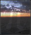
Transcendental Numberby lisaeComment: Thanks for all the comments! I know the photo has its faults, in aligning the numbers, etc. However, the transparency was clipped to some glass, which I stood up in the sand, and then I hollowed out a space for my camera in front of it (put a towel down to keep it safe :)). Because of this, I couldn't see the LCD screen at all, so it took a lot of trial and error just to get it this well aligned!
If I'd had time to reshoot, maybe it would have turned out better. |
| 04/13/2003 12:40:58 PM |
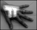
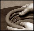
The Hand of Piby magnetic9999Comment: This is quite cool. Perhaps there is a bit too much going on in it though. The layered elements dilute one another, so the overall impact isn't strong. |
 Photographer found comment helpful. Photographer found comment helpful. |
| 04/13/2003 12:37:27 PM |
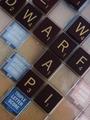
= 4 pointsby johnny_justjohnnyComment: Nice idea. Is there a coffee stain underneath the letters though? The photo overall has a dirty feeling. |
| 04/13/2003 12:36:05 PM |
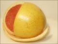
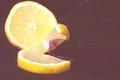
π rSourby justineComment: The slightly off-centre composition just makes it look as though you wanted to avoid centring the lemon. I prefer composition to have an artistic reason behind it. The colours seem washed out. |
| Photographer found comment helpful. |
| 04/13/2003 12:32:58 PM |
|
| Photographer found comment helpful. |
| 04/13/2003 12:31:29 PM |
Pidialby helgihelgiComment: I really like this photo. Great DOF, great composition, and really nice, rich colours. The textures are lovely too. |
| Photographer found comment helpful. |
| 04/13/2003 12:19:35 PM |
|
| Photographer found comment helpful. |
| 04/13/2003 12:19:04 PM |
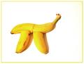
Banana Piby jodiecostonComment: Interesting idea, but I'm not sure if all the negative space really works. I think it weakens the impact of the bananas rather than strengthening it. I love the colours in this though, and the lighting is great. |
| 04/13/2003 12:16:41 PM |
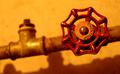
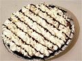
Pi with an Eby OneSweetSinComment: This is one of the less interesting pie shots. It's washed out and grainy, and the pie itself isn't highly visually appealing. |
| 04/13/2003 12:14:21 PM |
Play doh Piby CreativeFlyPhotoComment: I like the bright colours and the high contrast in this. It's better than a lot of similar photos in the challenge. The camera angle adds depth, and the white background keeps it clean and simple.
Yet, it isn't a highly artistic image. It still seems more like a photo that was designed to meet the challenge rather than be a work of art. |
| Photographer found comment helpful. |
Home -
Challenges -
Community -
League -
Photos -
Cameras -
Lenses -
Learn -
Help -
Terms of Use -
Privacy -
Top ^
DPChallenge, and website content and design, Copyright © 2001-2025 Challenging Technologies, LLC.
All digital photo copyrights belong to the photographers and may not be used without permission.
Current Server Time: 08/26/2025 02:03:32 AM EDT.