| Image |
Comment |
| 01/30/2009 05:30:17 PM |
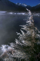
Last Lightby SaraRComment: I like this very much! I find it extremely pleasing for some reason--it just calls to me. I couldn't decide between 9 and 10, so I gave it a 10.
One small thing... It looked like you decided to crop it to a 5x7 proportion. I'm curious what it would have looked like if it was cropped in a little more from the right... |
 Photographer found comment helpful. Photographer found comment helpful. |
| 01/30/2009 05:25:26 PM |
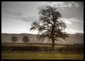
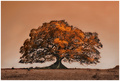
OAK OF AGESby melissamp99Comment: Very nice tree; it has lots of character. however, I wish the tree fit in the frame. It gives the impression that you couldn't move back any farther (or zoom out), and that it just didn't fit. I'd either crop more or less. |
| 01/30/2009 05:23:49 PM |
|
| Photographer found comment helpful. |
| 01/30/2009 05:22:57 PM |
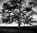
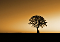
Standing Alone by J-MeComment: I like the photo very much... however, the white glow behind the tree looks unnatural. If it was a fluke of nature, sorry! If you lightened it to bring the tree out, it's a little overdone.
overall still very nice! |
| Photographer found comment helpful. |
| 01/30/2009 05:21:01 PM |
|
| Photographer found comment helpful. |
| 01/30/2009 05:20:53 PM |
|
| Photographer found comment helpful. |
| 01/30/2009 05:20:17 PM |
Summer Shadeby GregoryBComment: wonderful! but this is my favorite so far. (by quite a bit!) I love it being all shades of the same color. It's muted, yet the leaves still glow. |
| Photographer found comment helpful. |
| 01/29/2009 09:54:46 AM |
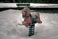
A world without children...by SD6Comment: Very nice idea. Two suggestions: the bench in the background being directly above the horse is disconcerting. A different angle that moves it to the right or left would help.
Also, I think it's a tad dark. I'd play with the levels a little and lighten the highlights. It's not that important to have the details in the snow, and you wouldn't lose anything from the horse.
great idea! |
| Photographer found comment helpful. |
| 01/29/2009 09:54:08 AM |
Shut Up!by GreatJobBobComment: Very well done. I marked it lower than some others simply because there are other photos that I like better, personally. But I wanted to let you know that I liked it very much. The only thing that bothered me was it seemed a little too centered. I'd be tempted to have the main image down in the lower left and have more counter (or whatever your background is) on the left.
thanks! |
| Photographer found comment helpful. |
| 01/29/2009 09:54:07 AM |
Shhhhhhhhhhhhhby aKiwiComment: I like the breaking of the rules. Usually you leave more room on the left when the person is facing the left. but bringing it to the edge draws your eyes in to the flowing hair.
Two very small issues: the wisp of hair showing on the left is distracting (extra fan to make sure it's all blowing back since you can't photoshop it?), and having her move the finger more to the left so that it's centered more on the mouth. It's a really small thing, but I liked this picture very much, but something bothered me the more I looked at it. So I thought you might be interested...
very, very nice shot |
| Photographer found comment helpful. |
Home -
Challenges -
Community -
League -
Photos -
Cameras -
Lenses -
Learn -
Help -
Terms of Use -
Privacy -
Top ^
DPChallenge, and website content and design, Copyright © 2001-2025 Challenging Technologies, LLC.
All digital photo copyrights belong to the photographers and may not be used without permission.
Current Server Time: 09/01/2025 04:05:21 PM EDT.