| Image |
Comment |
| 03/14/2009 02:56:49 PM |
The Professorby PenelopeKComment: Interesting idea, and well done, but not very realistic. I can't figure out why his hand would be at this angle. He's not pointing at anything, and not following along the text with his hand while he reads. So the picture starts telling the story, but the story doesn't go anywhere. 7 for well done, would have been 8 if I could come up for a reason why it was this way. |
 Photographer found comment helpful. Photographer found comment helpful. |
| 03/14/2009 02:54:25 PM |
Into The Lightby Mark-AComment: Interesting use of light. With the right side of her face completely shadowed, I'd like it a little better if she wasn't looking so far to the left. That much white in the eye is a little distracting. Neat shot, though. |
| Photographer found comment helpful. |
| 03/14/2009 02:53:04 PM |
Views Of A Clownby bubeltrubelComment: Very nice shot, funny! Just to be nit-picky (feel free to ignore this), I'd like the background a little more white than off-white. |
| Photographer found comment helpful. |
| 03/14/2009 02:51:49 PM |
|
| 03/14/2009 02:50:38 PM |
Nantucket's Brant Point at Sunsetby glencoppersmithComment: The placement of the lighthouse is a little uncomfortable. I think the rule of thirds would have been better here--or center the horizon instead of the land. Or move things to the left so we get the point of the land. It's a wonderful picture, but the cropping just seems off. |
| Photographer found comment helpful. |
| 03/14/2009 02:44:22 PM |
|
| 03/14/2009 02:43:49 PM |
Pinkby mindbottlingComment: Flamingo? anyway, very nice-- I actually would like a little more of the black background--the contrast is nice. |
| Photographer found comment helpful. |
| 03/14/2009 10:53:58 AM |
KIVAby NaldComment: Neat shot! I am curious what it would have looked like in color. |
| Photographer found comment helpful. |
| 03/14/2009 10:53:21 AM |
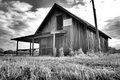
Gregg's Peachesby JEasonComment: Seems a little too centered to me, would have liked it off to the left a bit, and cutting off the top of the pole with so much foreground seems a little uncomfortable.
that being said, I love the building and I like the choice of black & white. |
| Photographer found comment helpful. |
| 03/14/2009 10:51:58 AM |
sundazeby rockitComment: This photo intrigued me, so I had to play with it a little in photoshop. I absolutely love the shadow on the wall, but the foreground seemed so dark, it was distracting. I played just a tad with levels and made the midtones brighter. It made the picture a bit brighter, which seemed to fit because the sun is shining directly at us, and brought out your brilliant shadow a little bit more. Fun shot! 8 |
| Photographer found comment helpful. |
Home -
Challenges -
Community -
League -
Photos -
Cameras -
Lenses -
Learn -
Help -
Terms of Use -
Privacy -
Top ^
DPChallenge, and website content and design, Copyright © 2001-2025 Challenging Technologies, LLC.
All digital photo copyrights belong to the photographers and may not be used without permission.
Current Server Time: 09/03/2025 06:18:29 PM EDT.