| Image |
Comment |
| 11/12/2004 04:55:14 PM |
Octoberby photomComment: I'm not too keen on the lens flare in this. When done well, I think it can add so much to the photo, but I don't see a need for it here. |
 Photographer found comment helpful. Photographer found comment helpful. |
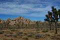
| 11/12/2004 04:54:14 PM |
Augustby KneeforuComment: I had a Joshua tree in mine too! Mine's not doing so well, though.
I like this one, just looks a tad underexposed. |
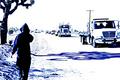
| 11/05/2004 01:36:48 PM |
Accident-smallby moviemanComment: Originally posted by saintaugust:
this is just a result of wrong settings on the camera??
cool effect though. i like it. |
Yup, just wrong settings. |
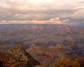
| 11/01/2004 03:03:43 AM |
Eveby ZoomdakComment: It bugs me a bit the huge contrast in color between the forground and the rest of the photos. That aside, I like it a lot. I really liked the colors (other than the forground) and composition is good. 7. |
| Photographer found comment helpful. |
| 10/25/2004 04:03:41 AM |
Red Fuelby bruskiComment: Focus could be a little stronger, but what a striking composition. The red really stands out, and is awesome. The reflection is really great. So focus is the only problem I see here. 7. |
| Photographer found comment helpful. |
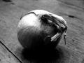
| 10/15/2004 01:02:57 AM |
Under the Skinby fotodudeComment: This photo really isn't of a very wacky food, but, I gave you a 7. The grain and high contrast really add to the photo, and composistion is perfect.
So yeah, awsesome photo. If the challenge was just food, I'd probably give it a 9 or a 10. Best of luck in the future. |
| Photographer found comment helpful. |
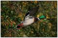
| 10/06/2004 08:44:55 PM |
Anas platyrhynchos - Mallard (Wild Duck)by agwrightComment: Brilliant colors. My only criticism would be to put the duck center. It doesn't really seem to follow the rule of thirds, or have a center composition, so it looks kind of funky the way it is. 7. |
| Photographer found comment helpful. |
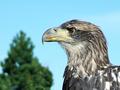
| 10/06/2004 08:42:14 PM |
Young American Bald Eagleby ws6_taComment: Focus seems a bit soft, but composition is nice. Colors are good too. Also, maybe there's a little too much headroom. |
| Photographer found comment helpful. |
| 10/06/2004 08:41:09 PM |
|
| Photographer found comment helpful. |
| 10/06/2004 08:32:04 PM |
- untitled - 2004 10 03 - 3134 -by spidermanComment: I'm not sure what effect you were going for, but I'm not really digging it. Other than the effect, I like it. The colors are nice, and the image is sharp. Detail is good, although I think it'd be greater without the effect. |
Home -
Challenges -
Community -
League -
Photos -
Cameras -
Lenses -
Learn -
Help -
Terms of Use -
Privacy -
Top ^
DPChallenge, and website content and design, Copyright © 2001-2025 Challenging Technologies, LLC.
All digital photo copyrights belong to the photographers and may not be used without permission.
Current Server Time: 09/03/2025 08:40:52 PM EDT.